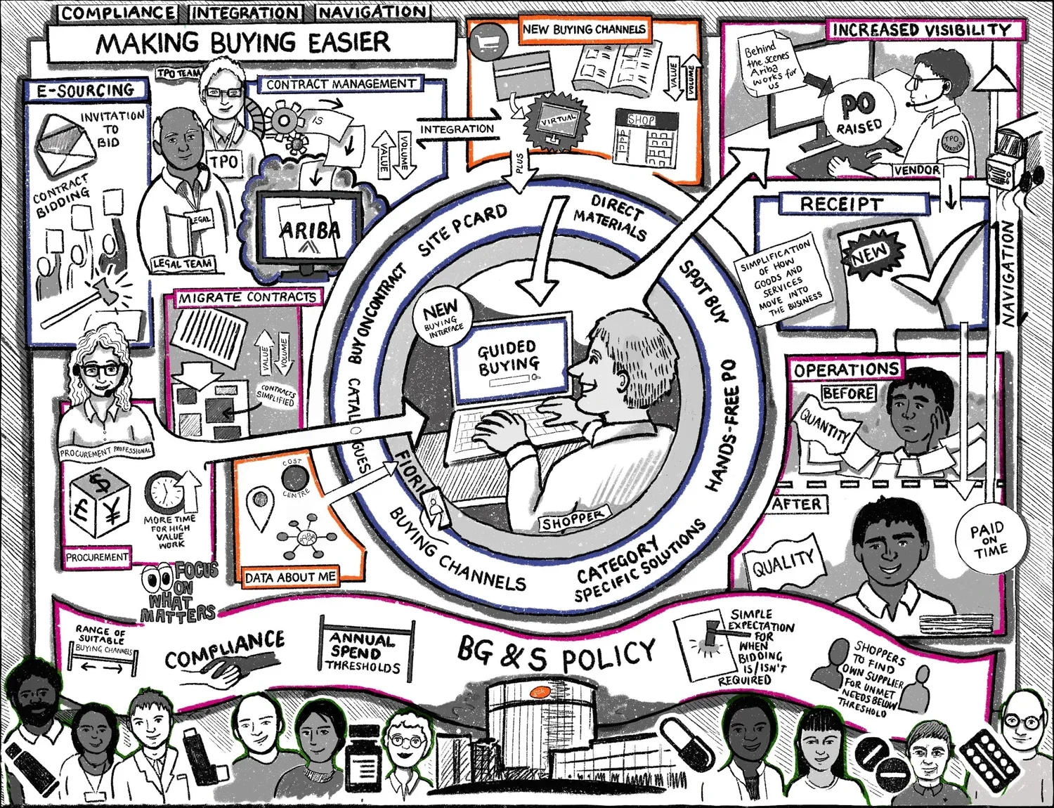
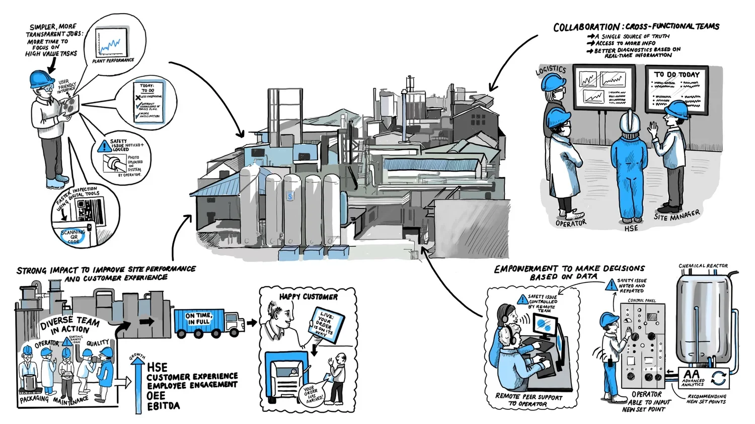
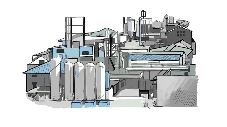
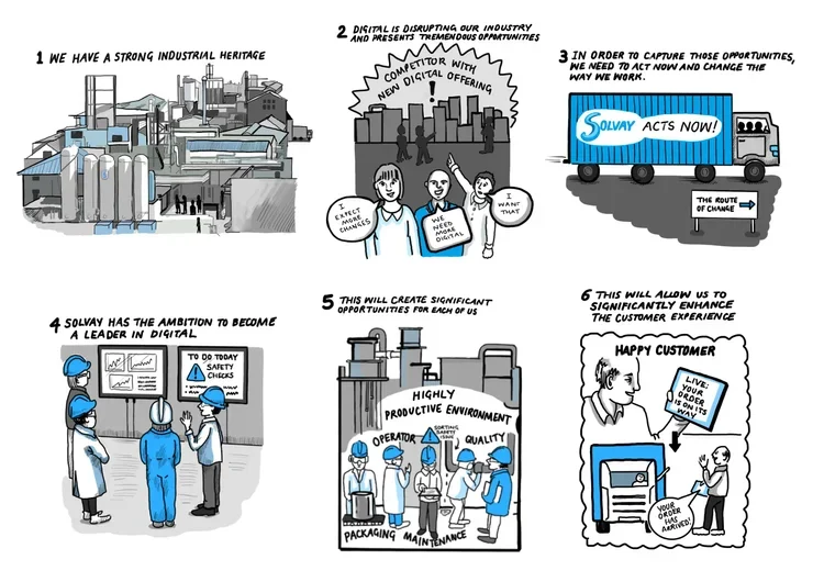
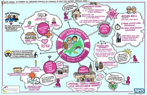
What is Graphic Recording?

Graphic recording is the visual recording of ideas and key messages using illustrations, shapes, and layout to educate the viewer quickly. It can be done by hand on paper for a live audience, and also digitally. Clients are often big corporations needing to share key messages with hundreds of employees in order to affect company-wide change. I have been graphic recording with Inky Thinking since 2017 and have worked with a large number of diverse clients, creating hundreds of images in the process.


GSK creative process

I was asked to create an infographic that described the buying processes in place at GSK that people within the business could use to gain a quick understanding. I include here various stages of the creation process, where you can see how I have started with rough note taking and gradually built a core physical structure to lay information and images within. This was guided by sitting in on team calls and with feedback from the client. Work was all done on an iPad using ProCreate.

Slide 1

Slide 2 - the first draft of the structure, with later edits overlayed.

Slide 3 - a cleaner structure, created by working on a layer over the first draft to guide myself. Later edits in red are visible, guiding myself as to what the client wants in more detail.

Slide 4 - a clean layout with full text. It is not finished but was sent to the client at this stage for feedback.

Slide 5 - The client liked the muted palette, and some tweaks were discussed which I colour coded, as you can see on here.

The final version - the client and I agreed to lightly colour code different areas reflecting the different parts of process, which I did by lining different areas. The small tweaks have been made, and the finished graphic signed off. This piece of work could be done in 2-3 working days but the nature of when you do work is often more piecemeal.

NHS Draft and Final piece

I often forget to save the process versions of my work. There are a lot more stages to it than the ones I show here, but my layout sketches give a good indication of my starting point. Essentially, I have to create a scaffold upon which I can build the visual information. You can see here that this is what worked for this NHS client.

Main draft - Rough illustrations demonstrate what I am planning to draw and is helpful if the client wants to see this stage. Writing out text can help when types of space and text boxes need to be considered. In this case it was quite straightforward and I worked on a layer over the top of this draft to create the final piece.

The final piece. You can see that everything has been cleaned up and drawn out carefully, though the messaging is the same as in the draft. Limited colour palettes are often important in corporate work in order to signify brand alliance and clarity about what the imagery is for.

Solvay work - finished pieces

I include this series of images to demonstrate a piece of work that was about a series of smaller infographics rather than one large piece. I was particularly pleased with the cleanliness of the images I created here, and the simple blue and grey colour palette. I felt that the images were interesting to look at without distracting from the messaging. What is interesting is that I feel I often create better work when I visit the client offices in person, it is easier to feel connected to the messaging and company culture. These images were again created using ProCreate on my iPad.

Demonstrating working processes in a Solvay plant.

A Solvay Plant

6 Images that capture Solvay’s digital ambitions at the time of creation.