Stage sets…
I have been given some BIG commissions. I mean, physically, HUGE. Scroll down for process pictures and details about the works…
Mill Farm Music: Part I
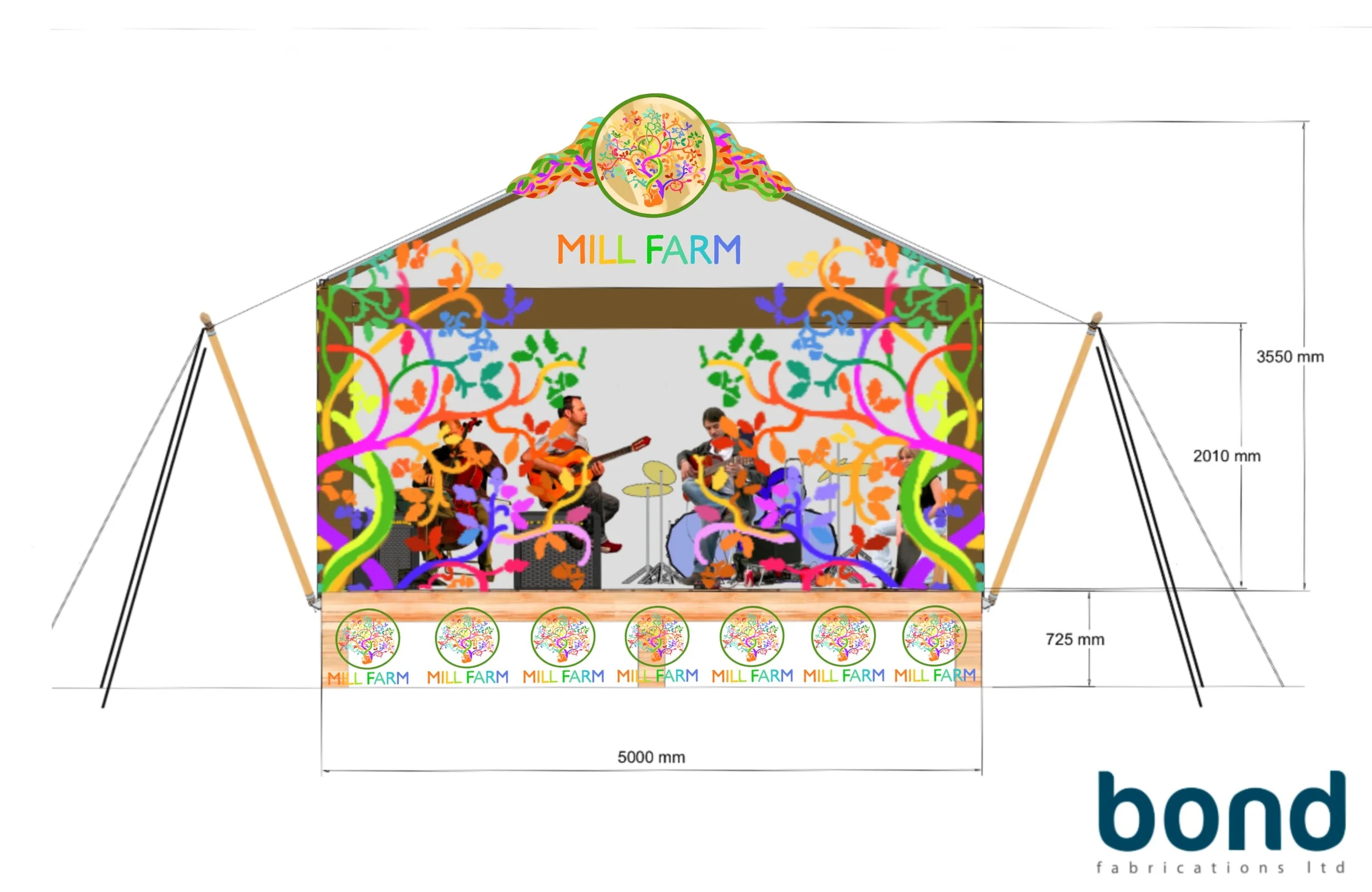
The finished stage backdrop for Mill Farm Music, Bradford Abbas, Dorset, UK.
In late 2019, I was commissioned by Mill Farm Music and Bazaar tents, an events enterprise that also run a recording studio, all on site in rural Dorset. Mill Farm wanted a hand-painted backdrop for their main stage. I came in very much at the beginning, when the stage itself was being designed, and so was able to spend a lot of time sketching up ideas whilst sitting in design meetings.
Mill Farm have an intricate logo of a fox sitting underneath an unfurling tree. It speaks to their rural location and love of nature - Mark and Anne who run the farm have a wide range of animals, from gorgeous miniature black sheep to chickens, spaniels and alpacas. They also have a love of 60’s music, and some of the pre-existing designs for their commercial recording studio are heavily psychedelic patterns. I wanted to use inspiration from all of this in the backdrop. I took the original logo and digitally split it, mirroring the section I chose across both sides of the backdrop. Then I added in as many different colours as I felt worked. I deliberately left a space in the centre for the lead performer on stage to be profiled by.
The (fluorescent) digital design…
I designed the backdrop digitally as I needed the opposing sides to match up in measurement terms - also, the brief was tweaked a lot as we went through different meetings, so it was much easier to make quick changes and get feedback on the design by working on a digital drawing app.
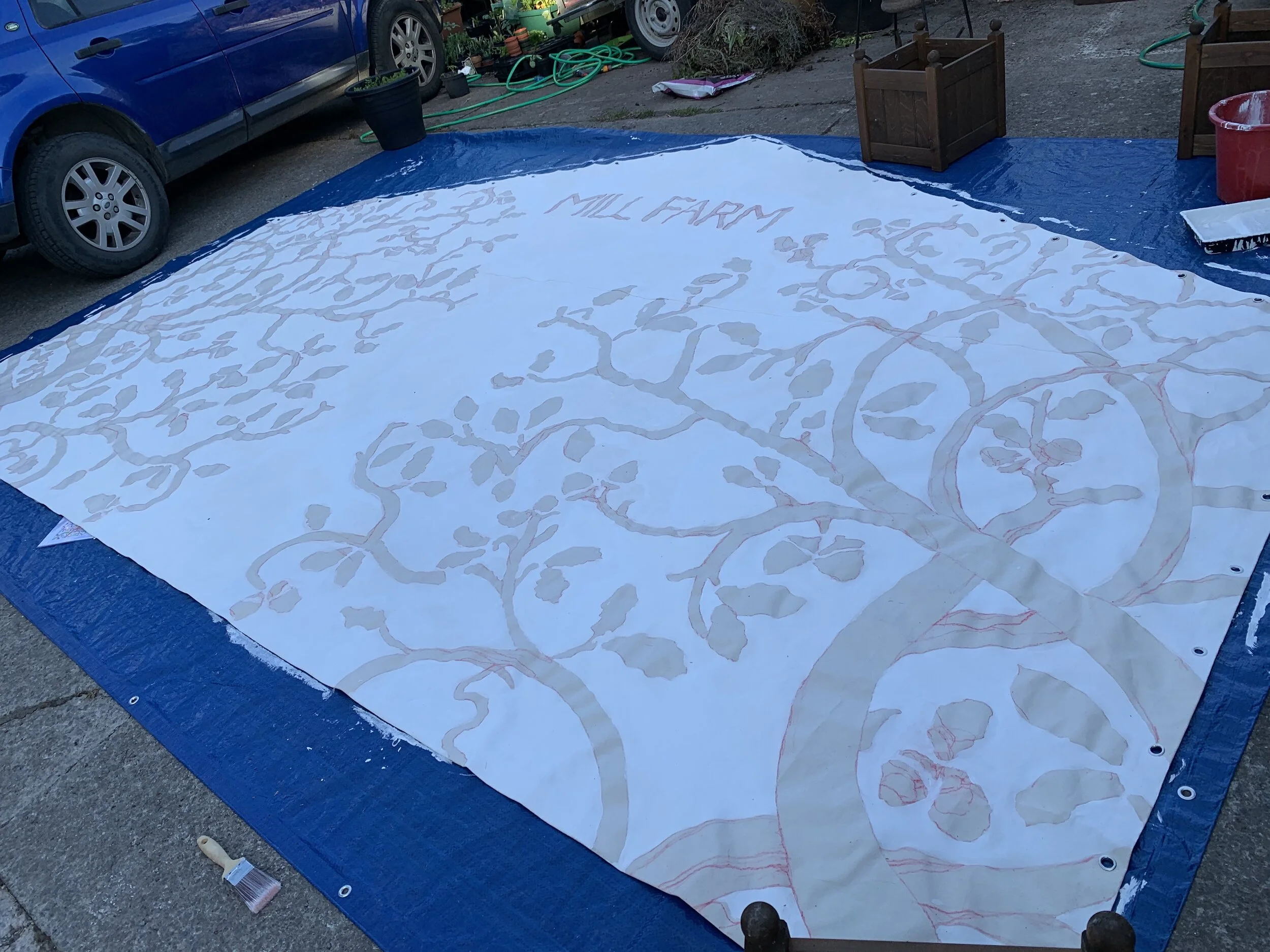
Work started in May 2020 - in full lockdown…
We decided, based on previous experiences (see the stages project below), that the backdrop would be made of pure cotton Duck canvas, as it has a tight grain and holds paint extremely well. The surface was not primed, except with fire retardant for health and safety reasons - which doesn't seem to have too much impact on the painting process. The canvas is 5 metres across, and at the apex is roughly 3.5 metres high, so it was a large space to cover with a fairly complex design.
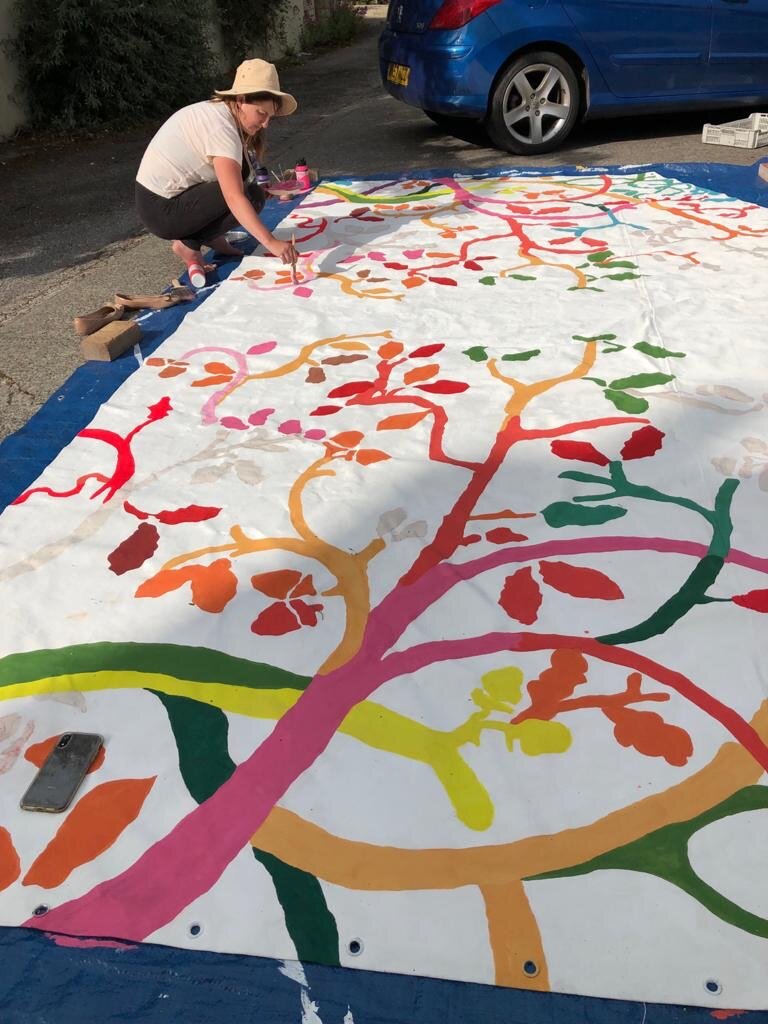
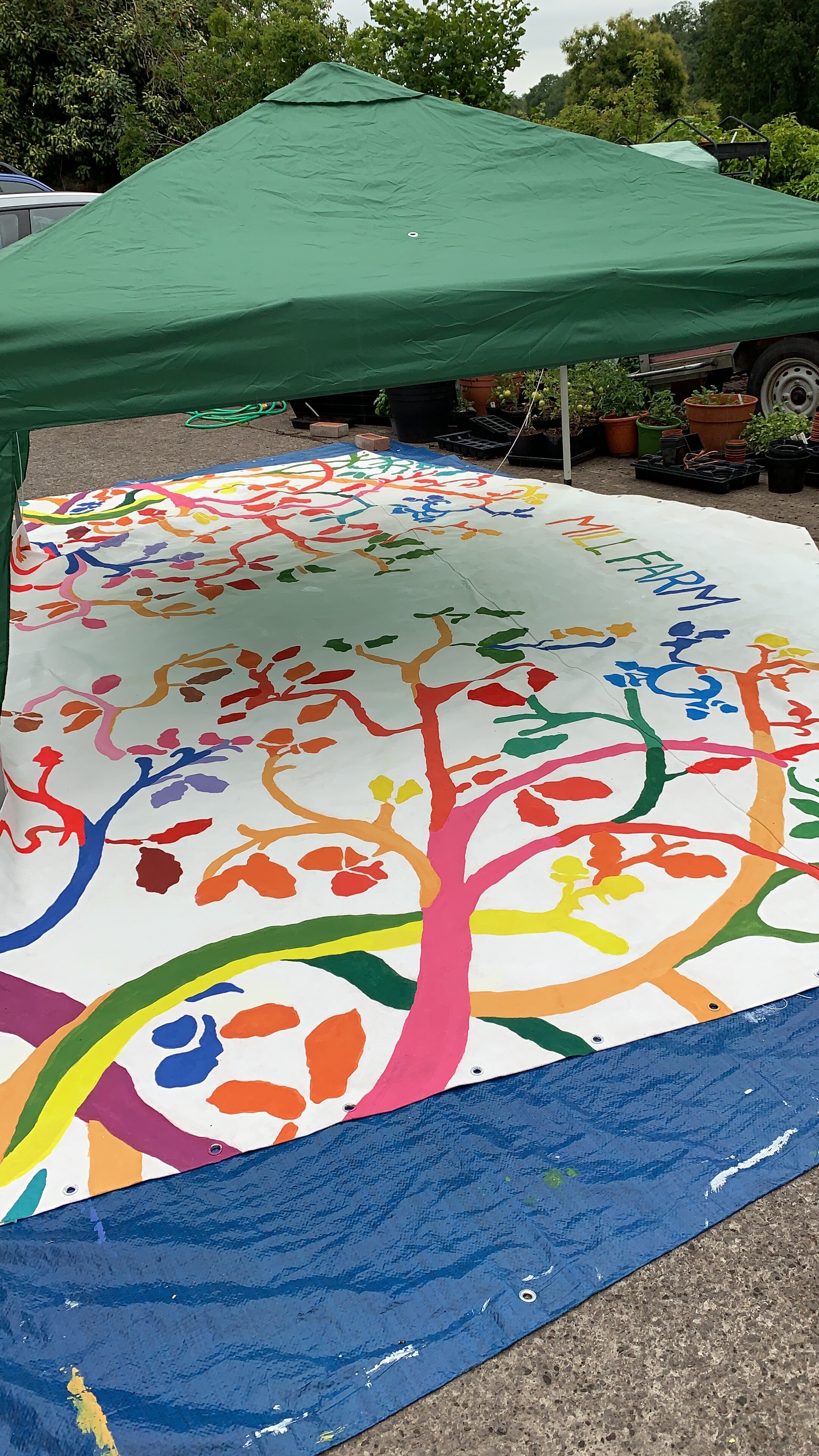
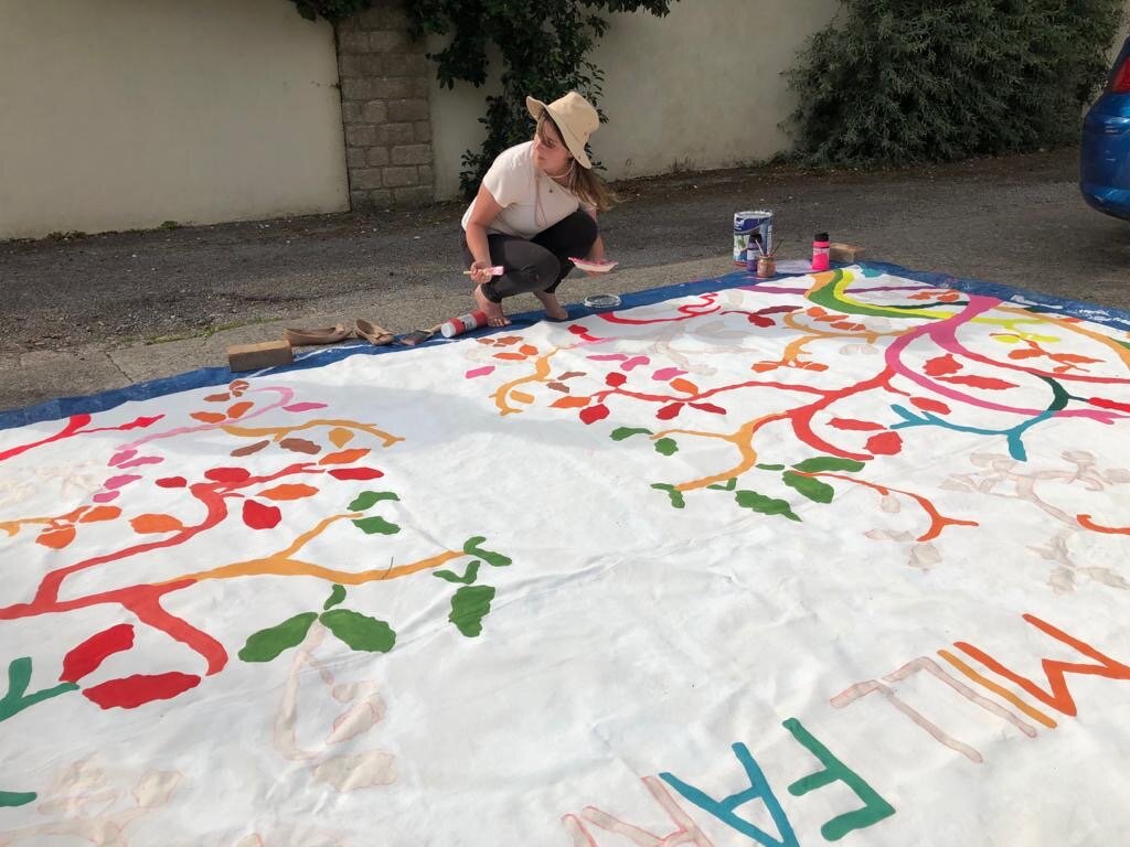
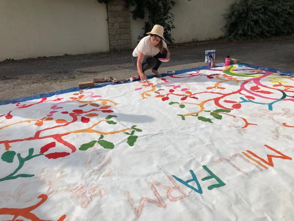
Working in the boiling early June sun with my hat on. Normally I would use a large empty barn, but lockdown meant I had to make do in a yard. Ideally I would also hang the work as it was so hard physically and for viewing painting on such a large scale totally flat, but again, we made do with what was possible. Each night I would semi-roll it and put it away. I used exterior household white emulsion to paint the entire canvas white apart from the patterned areas. Unlike a primed canvas that you might do an oil painting on, because this is raw, you have to really push the paint into it so it saturates the material - this stops it drying as a surface layer which could then flake off. It works well as a process because the material is holding the paint and you can roll the canvas if you need to. This is also why I didn't just paint the whole surface white and then draw the pattern on top - I wanted to avoid layering. I used artist acrylics for the colours. If you look closely you can see that there are multiple shades of yellow, red, green, pink, and orange - it took what felt like ages to finish!
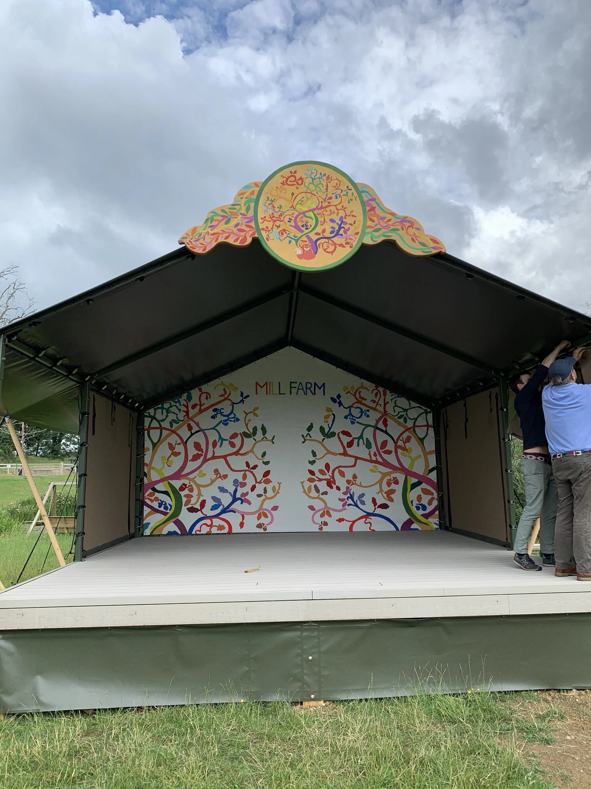
Up it goes!
The backdrop hooked onto the perimeter of the back of the stage - the canvas had specially made eyelets already in place for this. This photo was taken just after we had put it in place. Lighting is needed to highlight the back.
Mill Farm Music: Part II
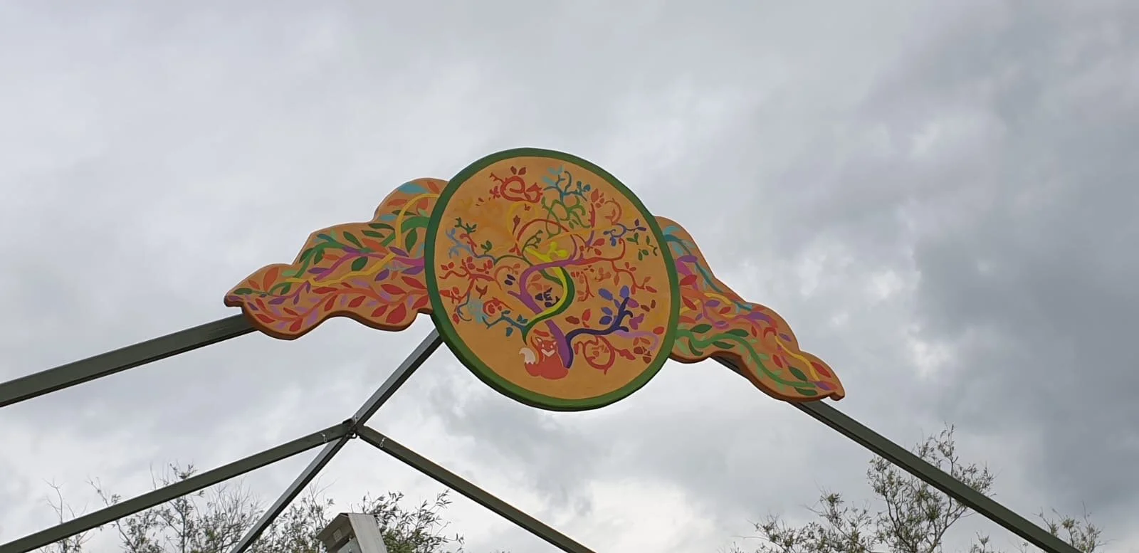
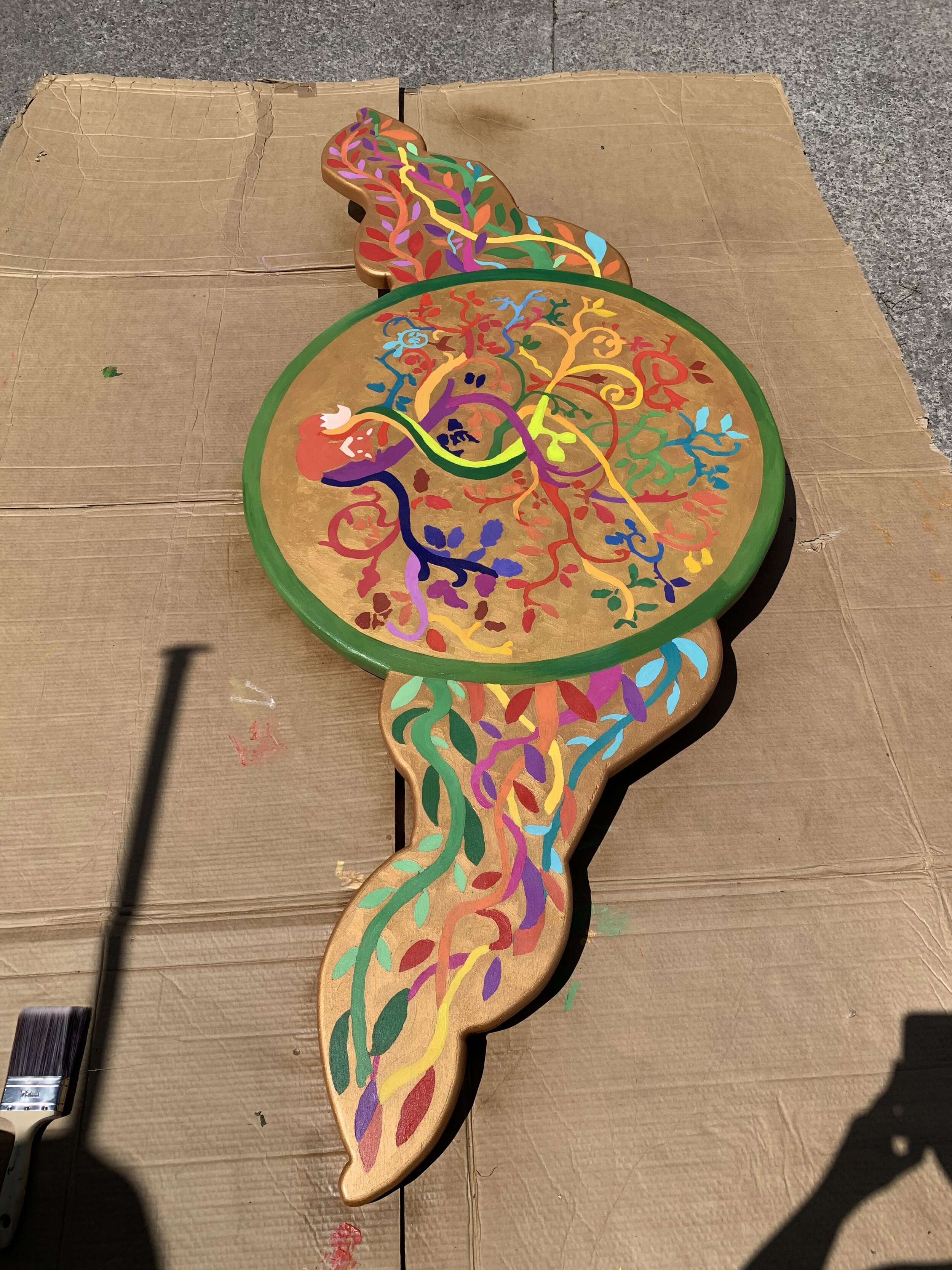
The crest
Now for the crowning piece…I really pushed the idea of a crest to top the stage. My favourite festival (local to where I grew up) is Glastonbury, and I was struck by the semi-3D stage crests they re-design every festival (or used to) for the main stage. I always felt that they “sealed” the stage - they made it funky, unique, memorable, like a literal crown. So, now to come up with a version for Mill Farm…
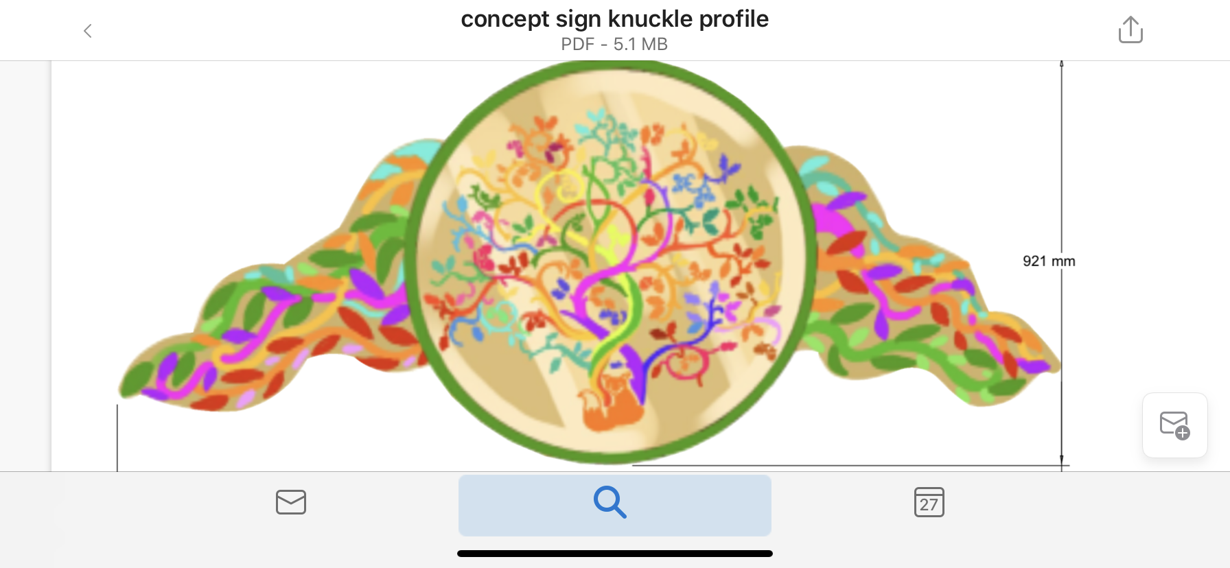
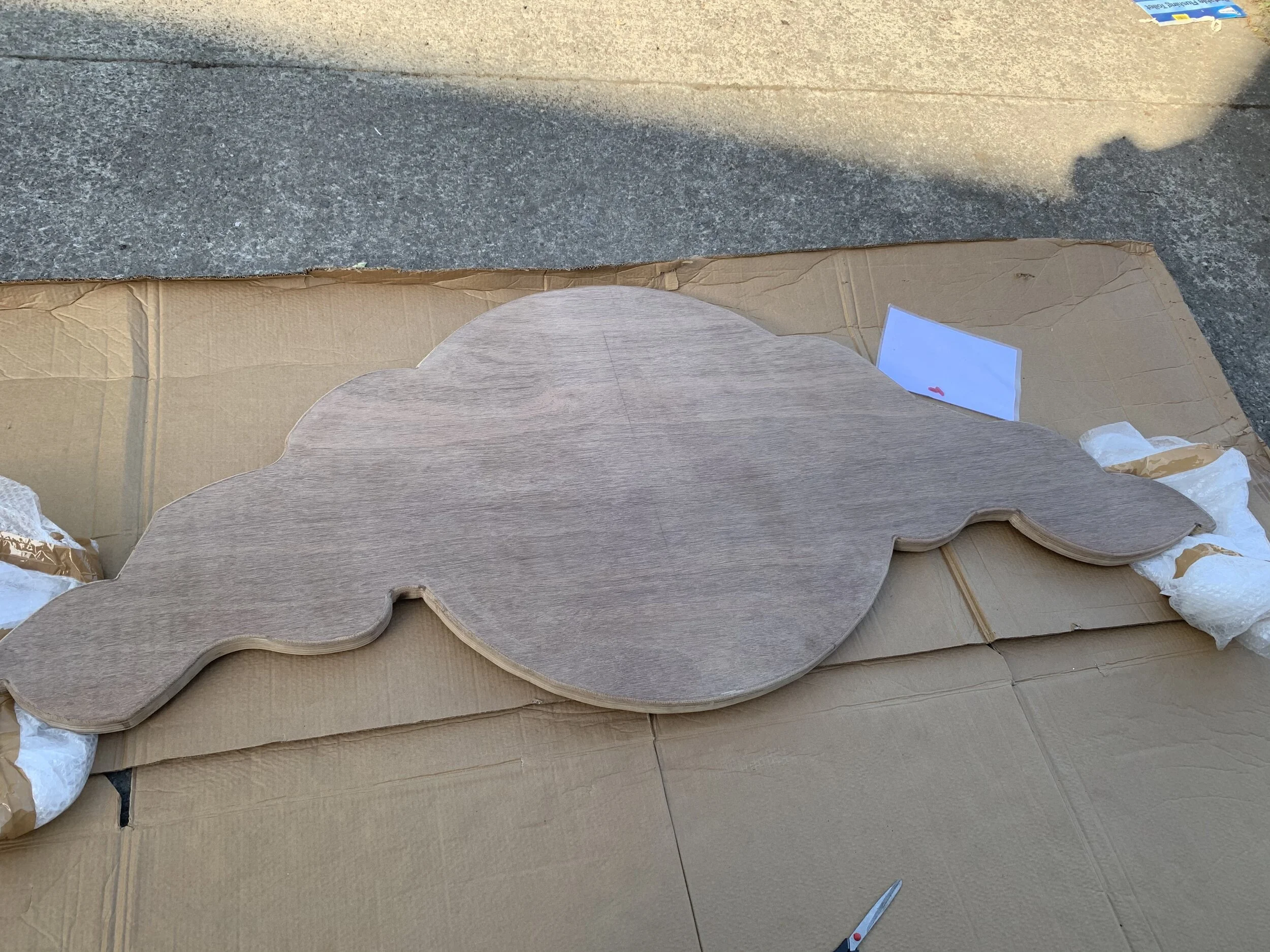
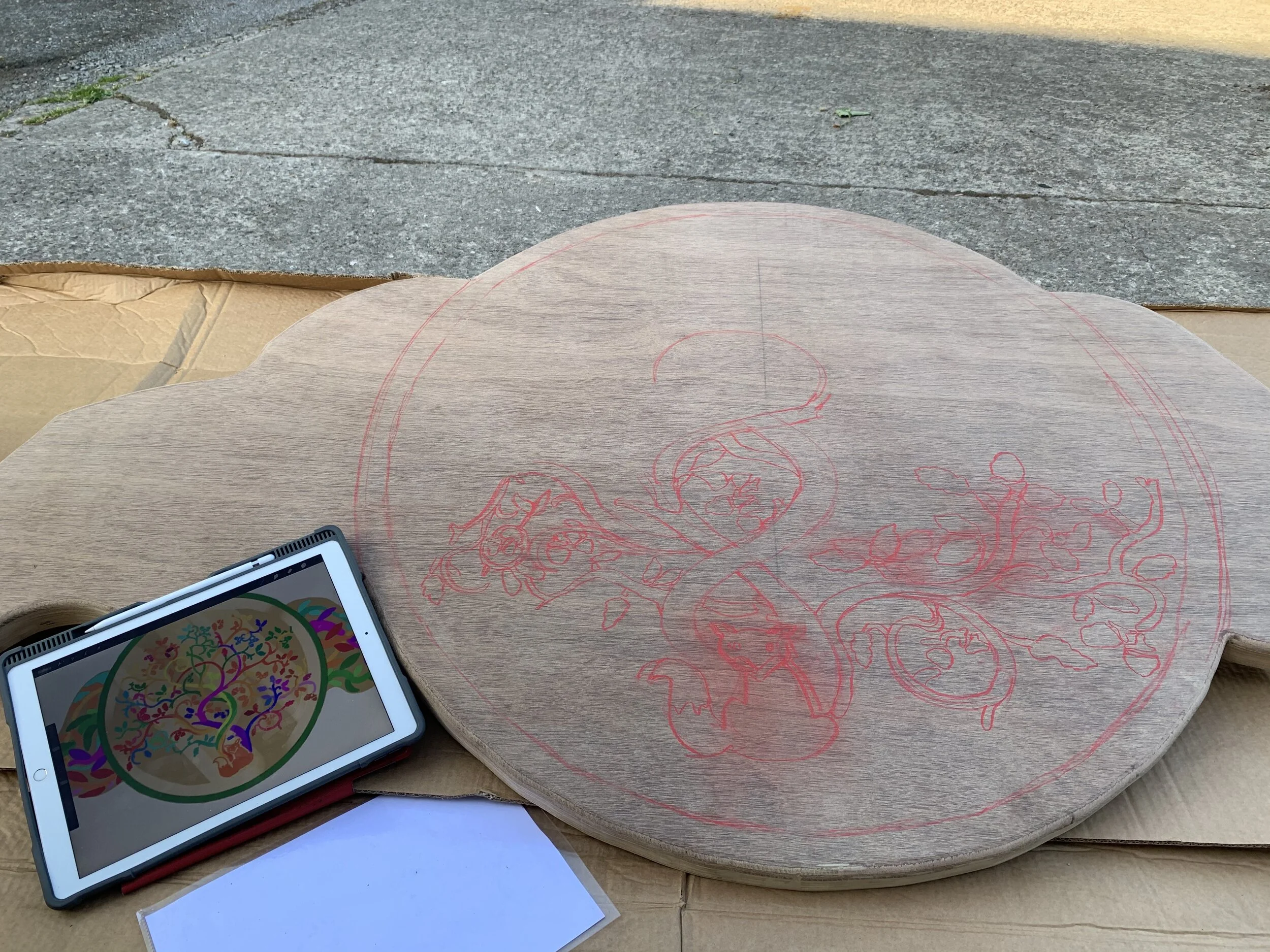
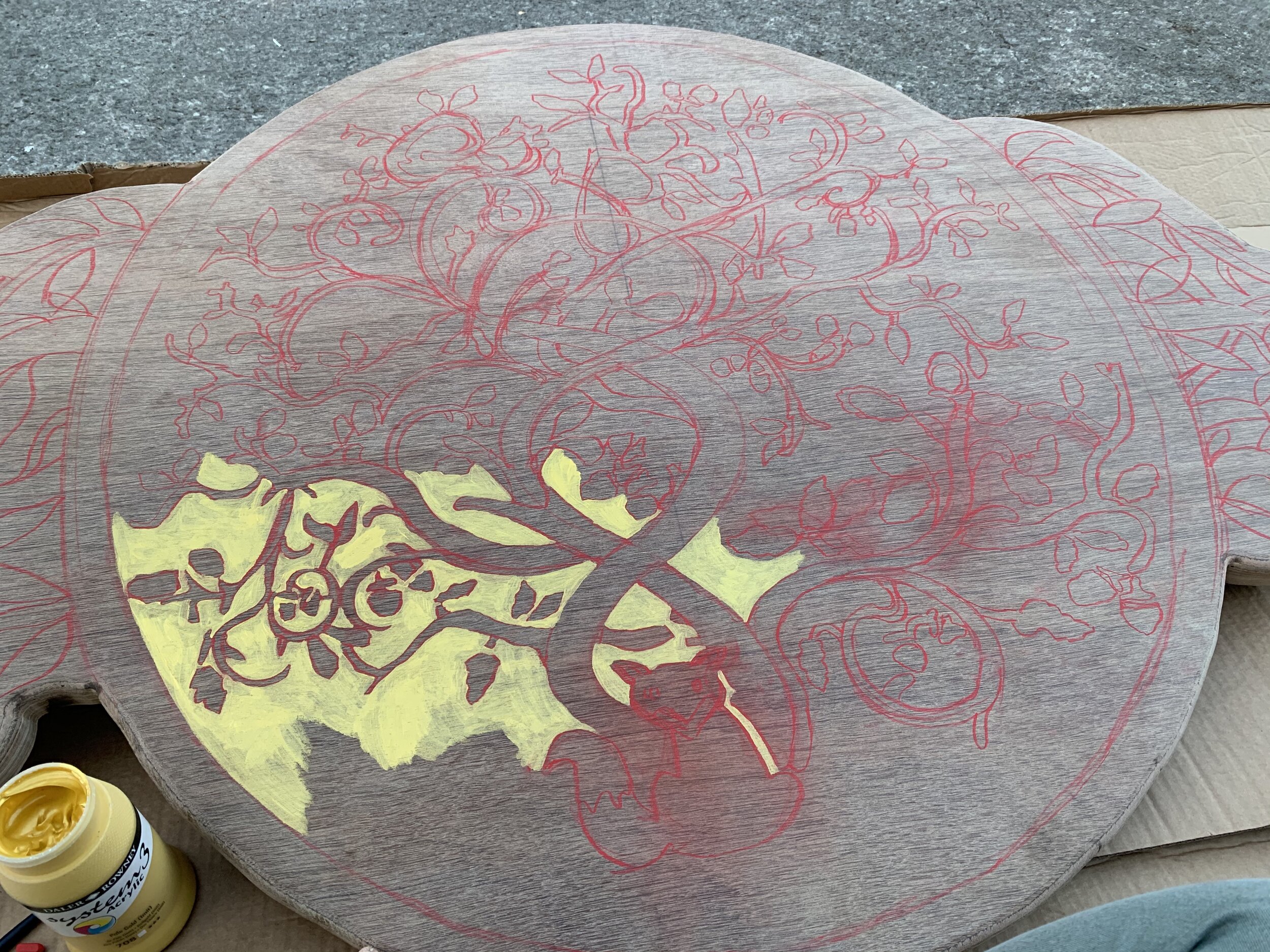
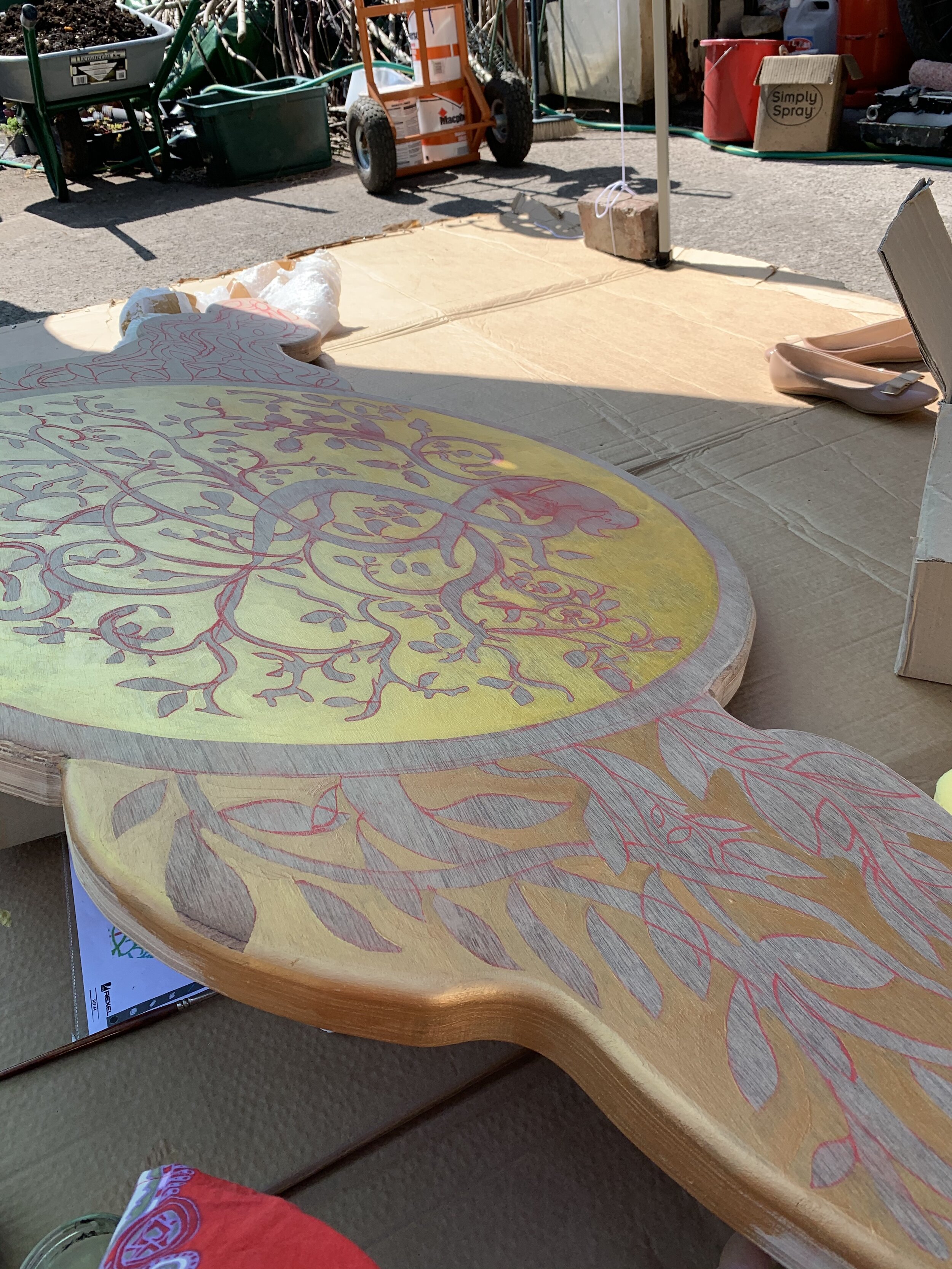
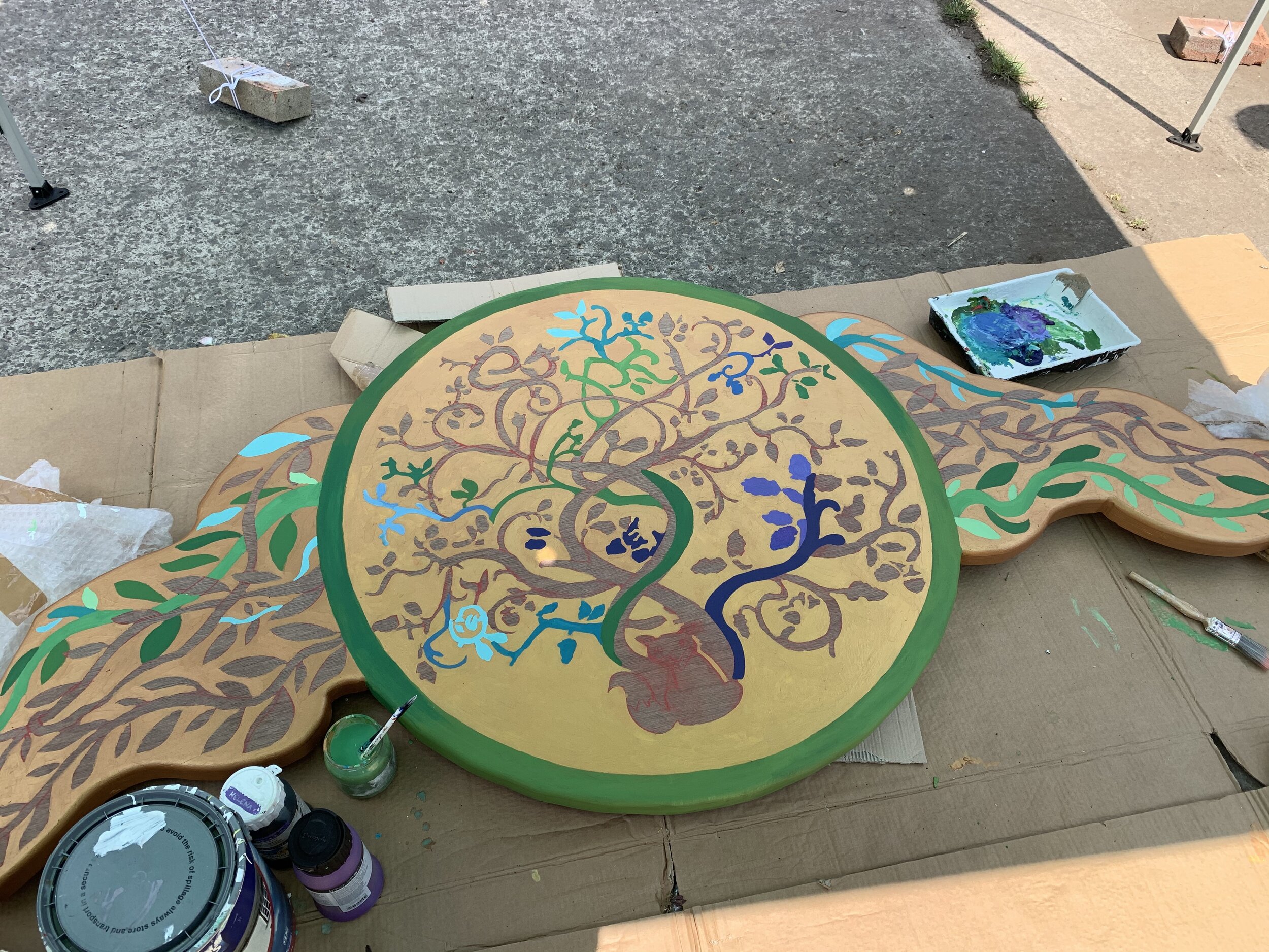
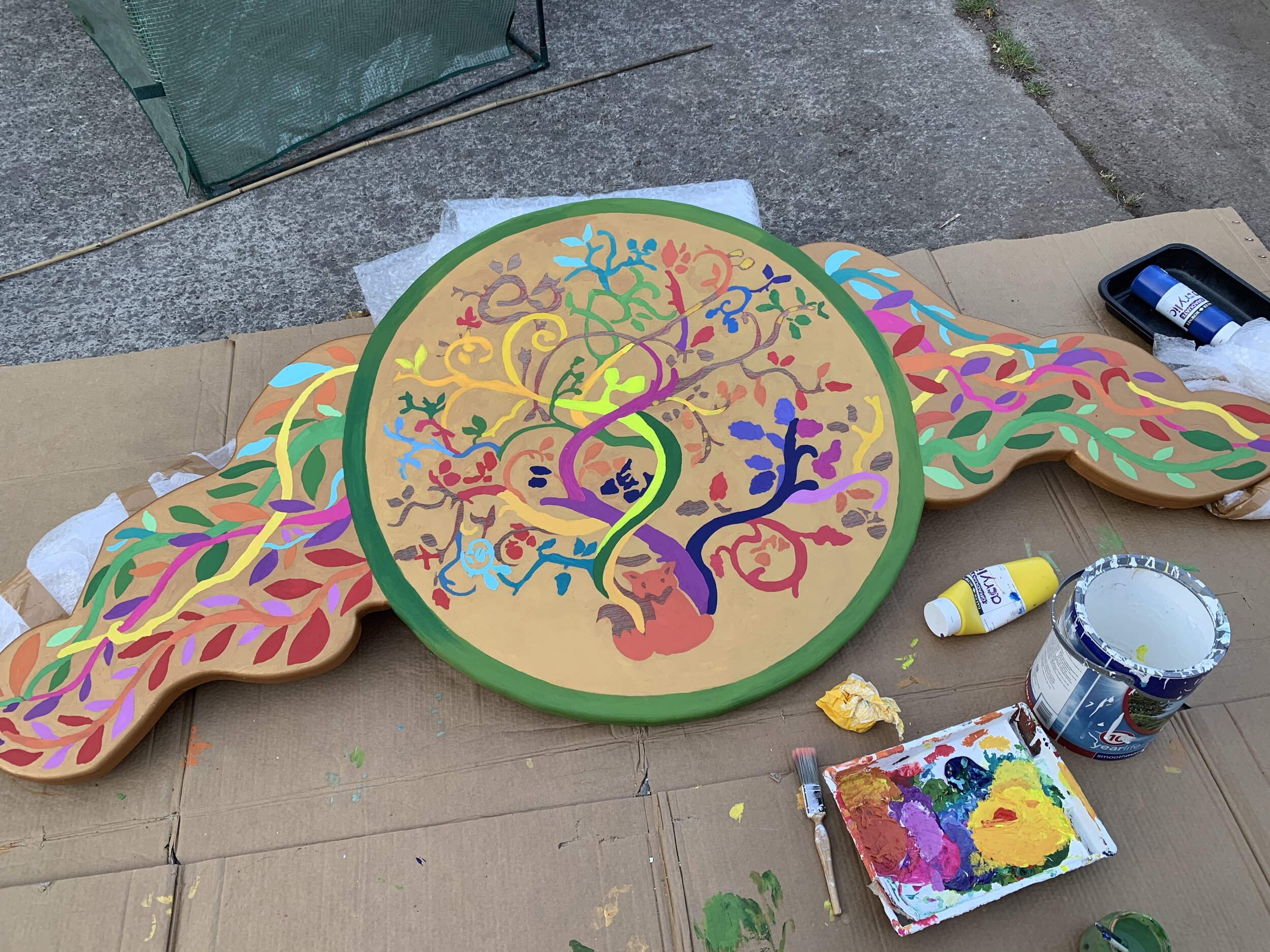
I worked digitally to design the crest. I wanted it to look like a medallion with flames fanning out of the sides. I created a few versions, but this one was a clear choice. I took the original Mill Farm logo as my main inspiration again (top left), and replaced the background with bright gold, adding vines expanding out as multi-coloured ‘flames’ at the sides. The wood is marine ply, laser cut to my design and then sanded (and yes, my two flame sides are not carbon copies of each other in measurement - deliberately so, to make it really feel handmade). The crest is 2 metres in length. I used artist acrylics for the whole crest, trying to minimise water use as it dilutes the colour. I had to do several layers of the gold to make it opaque, which also gave it a lovely ‘hammered metal’ look. I then sprayed the piece several times with exterior, non-yellowing varnish.
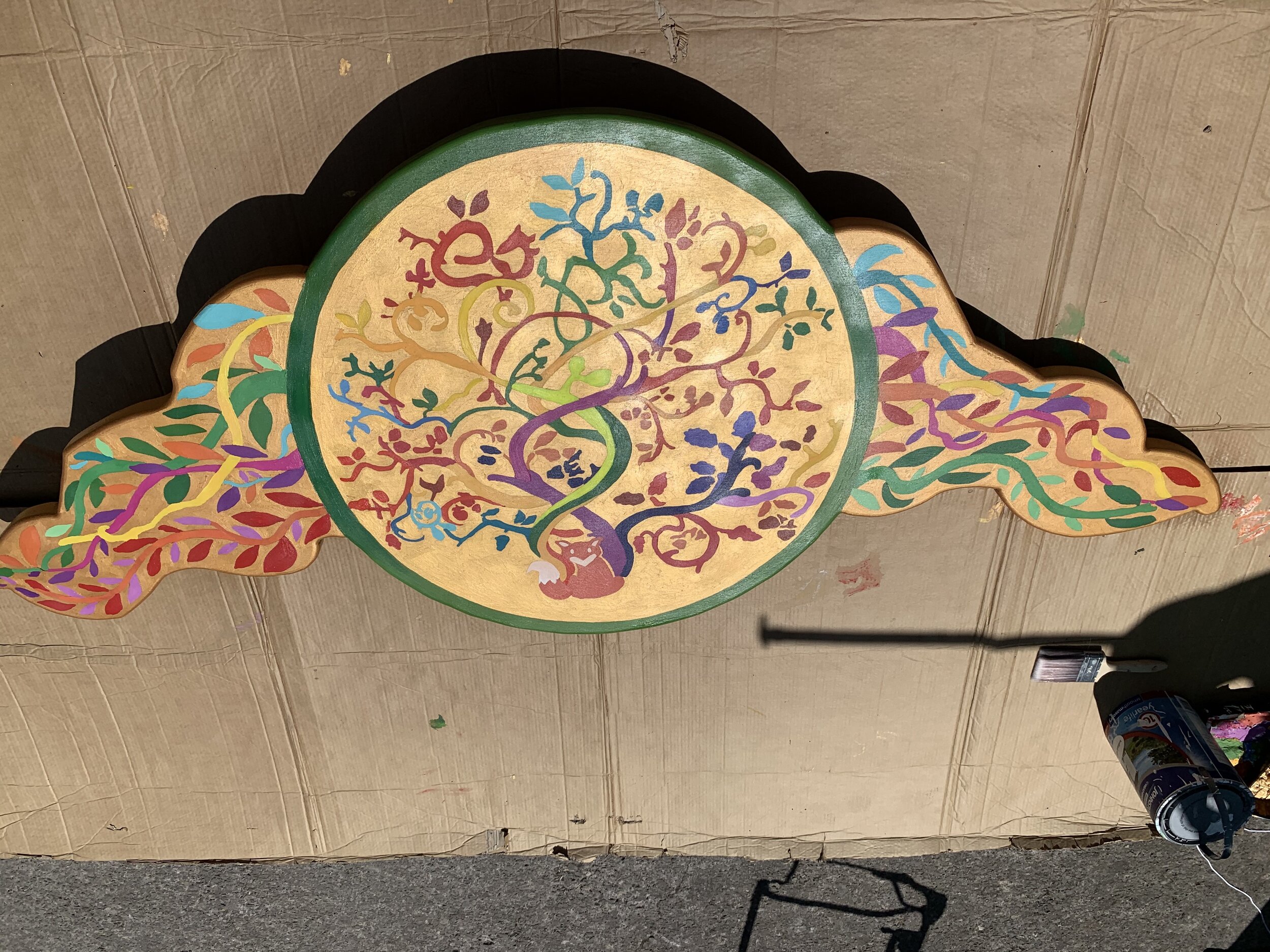
The finished piece! It catches the sun just how I had hoped. It was hard to get it all in one frame, whilst showing enough of the detail.
Here it is below at the centrepiece of the stage. It was hard to put up, and next time, we are considering working on aluminium for its lightweight durability. However, I am so pleased at the end result and feel that it holds the stage together visually. It also catches the light at the farm really well during the day.
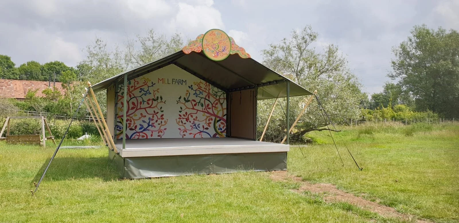
Stage finished!
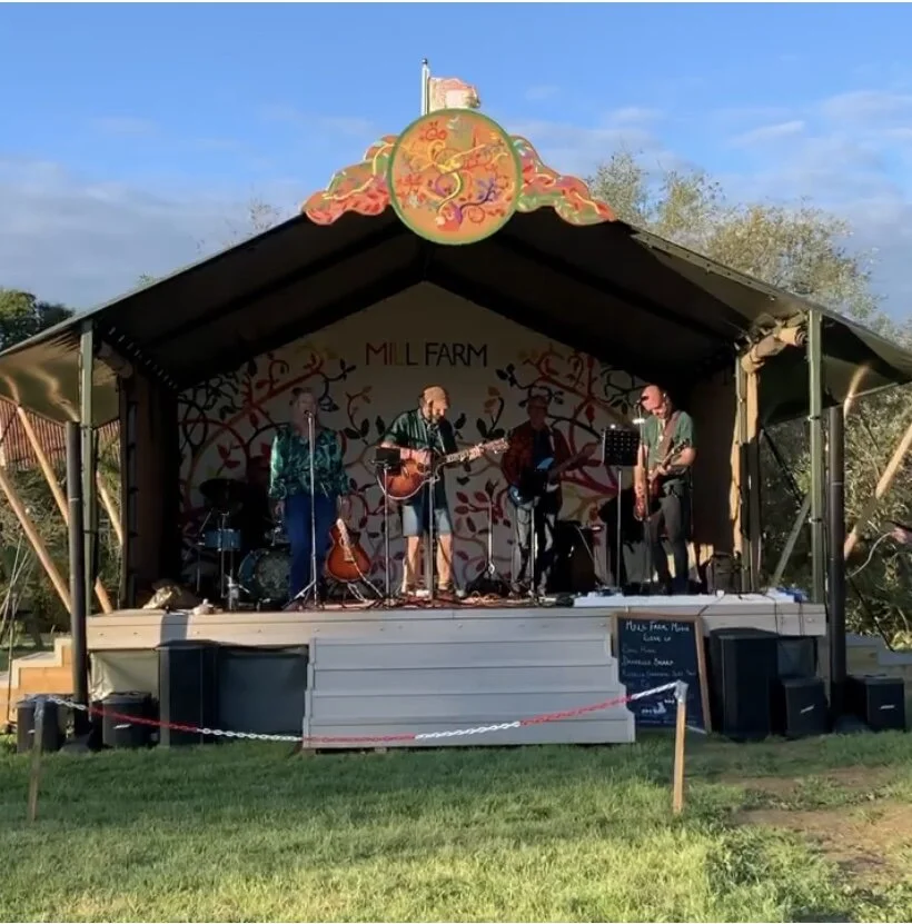
This is Mark and Anne with their band at the first socially distanced event in late August 2020. The audience were in family bubbles in open backed sheep pens to safely distance. The sun was out, and it was amazing to see the stage in action. For the next event, lights will be put up at the back of the stage to highlight the artwork and band.
Mill Farm Music: Part III
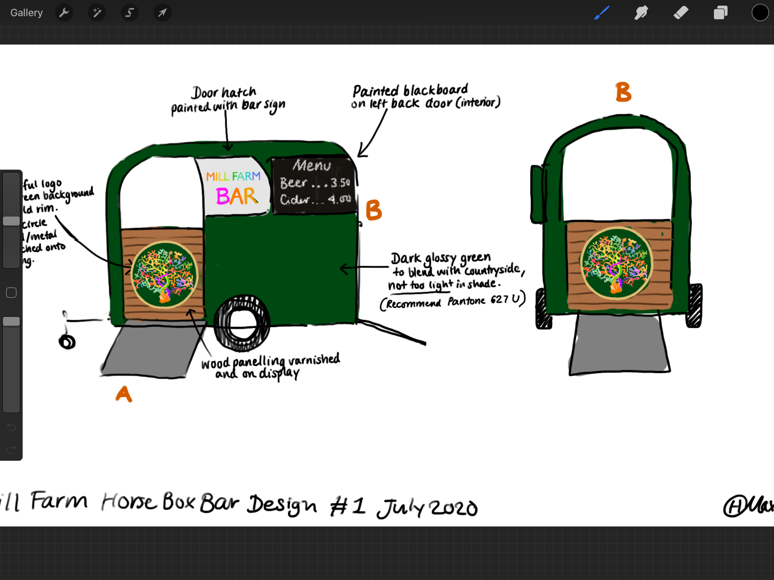
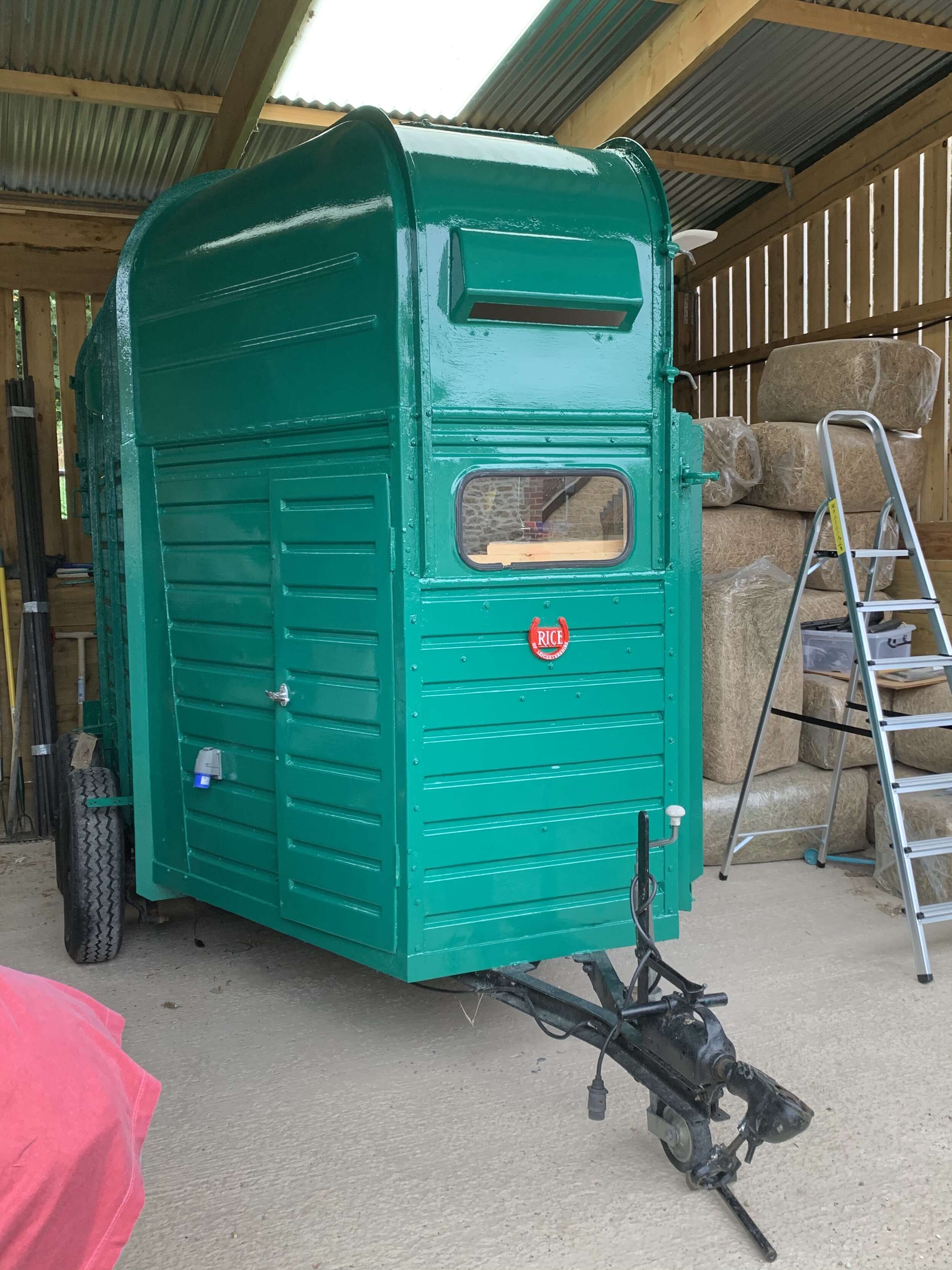
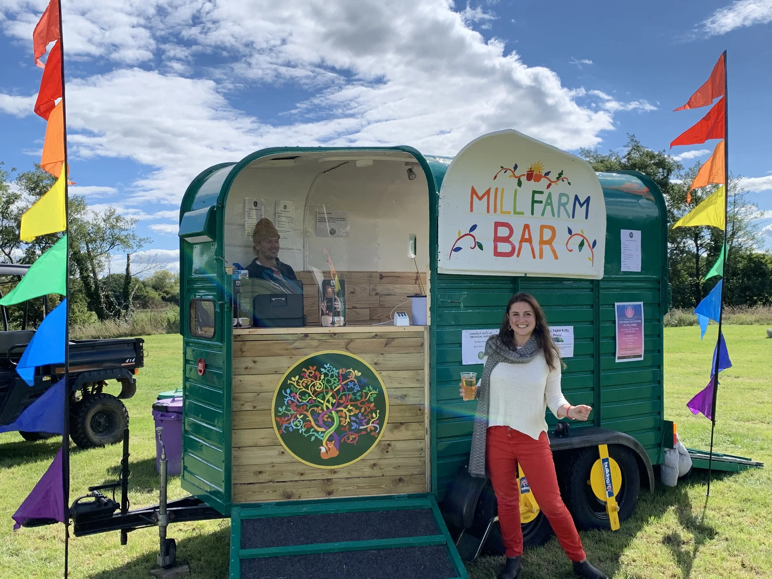
Designing the horse-box bar…
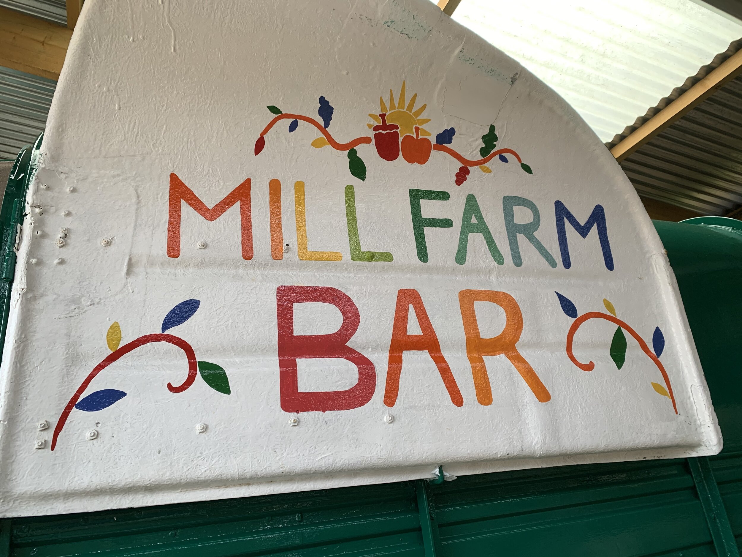
I was also asked to re-vamp a horse box that had been converted into a bar, but was a pale grey colour and needed the Mill Farm festival stamp put on it!
Below is the painted interior of the front right door that swings back to create a bar hatch. I chose the paint colour for the exterior to hint at the countryside green, and green of Mill Farm, but also to stand out enough as a fun, glossy shade. I hand painted the sign using little pots of enamel - the same people use for model train sets. I also used the red to highlight the horseshoe logo at the front in red (below right).
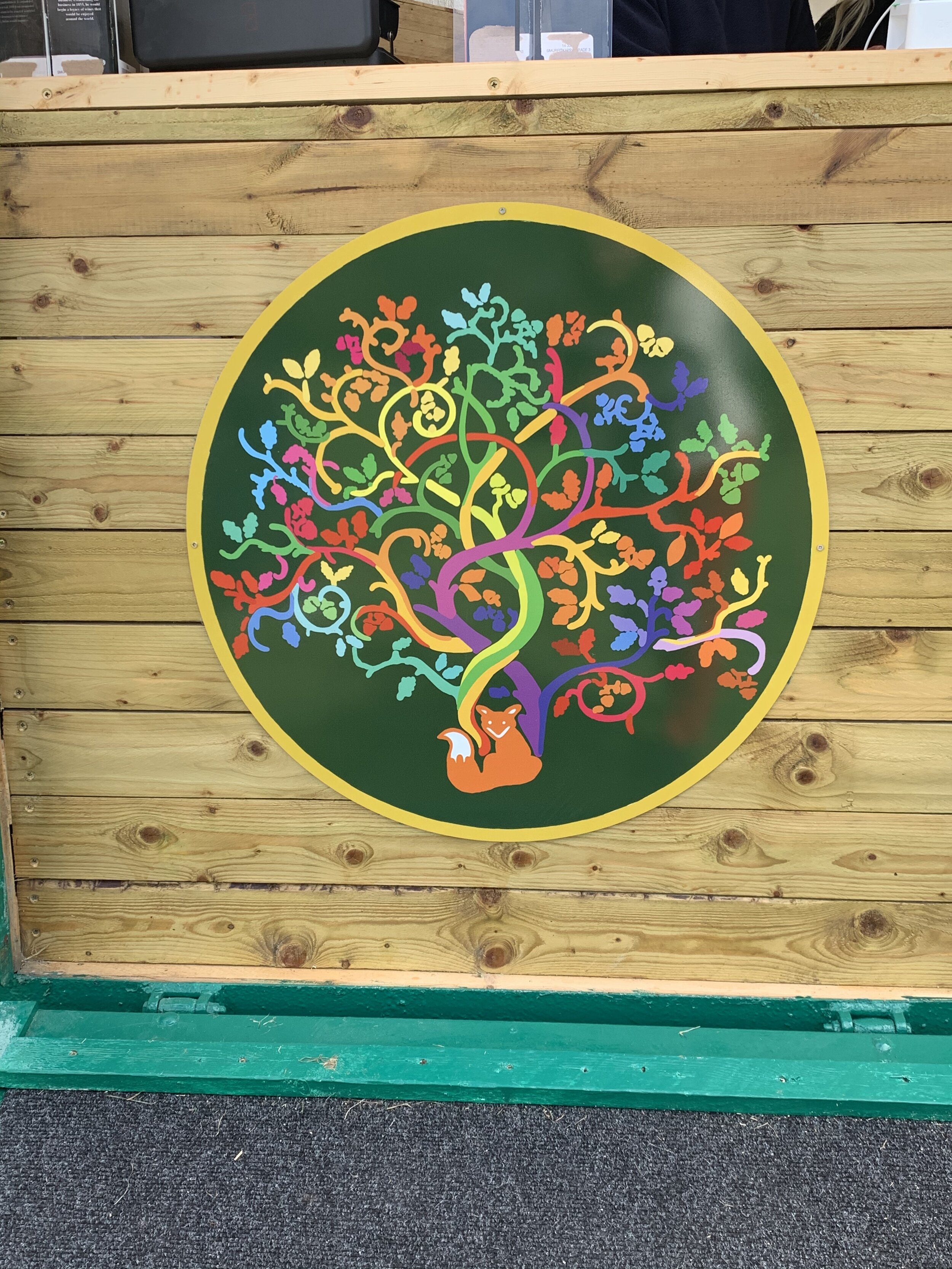
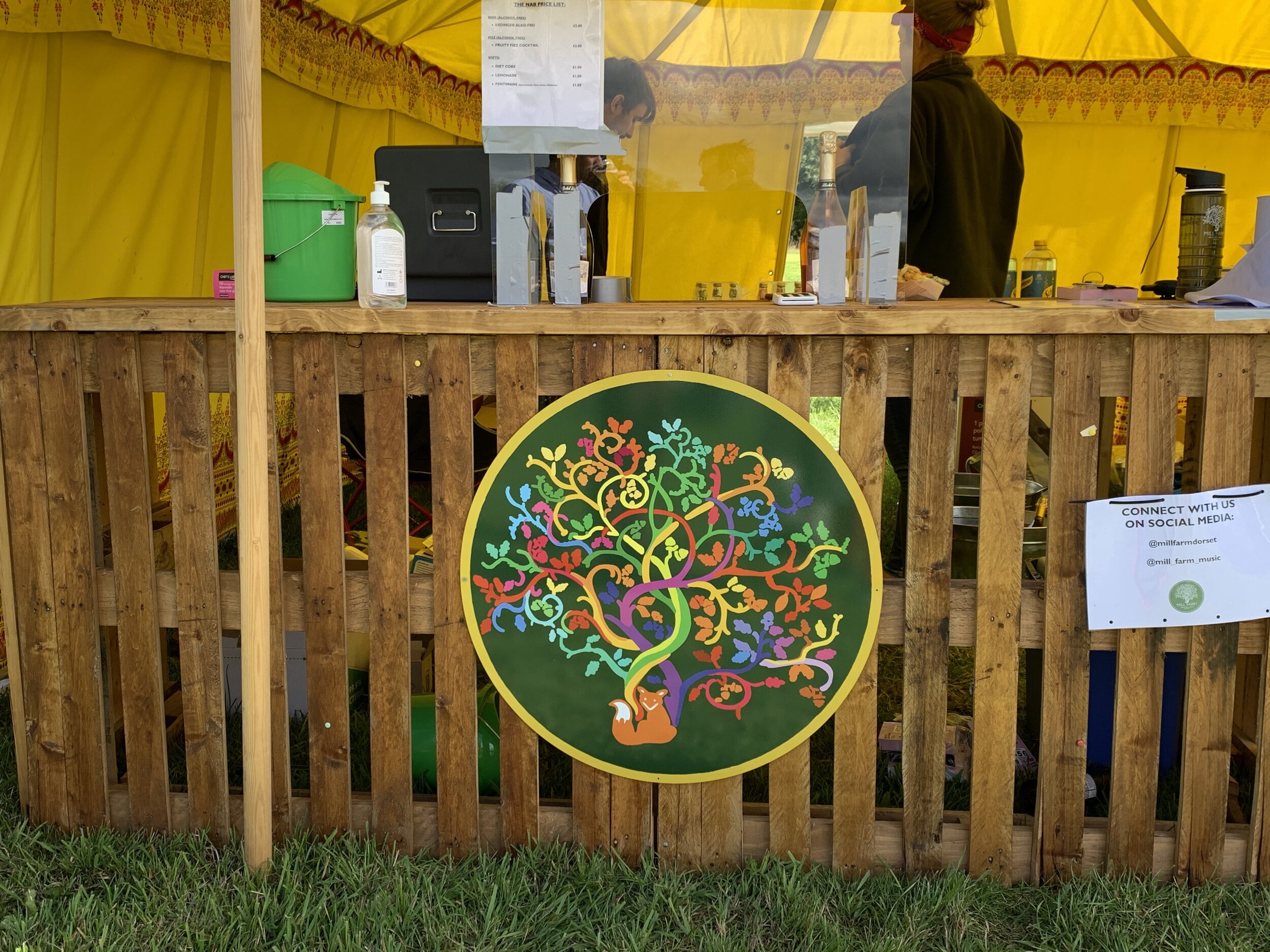
Mark wanted to have more reproductions of the ‘festival’ Mill Farm logo around the site, including two on the horse box bar fronts (it has two access points - at the back, and front right). We decided to print a digital design onto aluminium to save time, also because there was not such a need for them to be hand painted. I took the colours from the stage crest logo, and put a similar shade of green instead of gold as the background. I created the image in a vector file which means that you can print without risk of pixelation. This was important as the aluminium logos were large (approx. 0.7 metre diameter). Printing on aluminium is great, it’s cheap, the aluminium is light, strong and durable, and the company I used ensured a lightfast finish. Here they are below:
And here is the final horse box - I was so pleased with the colours!
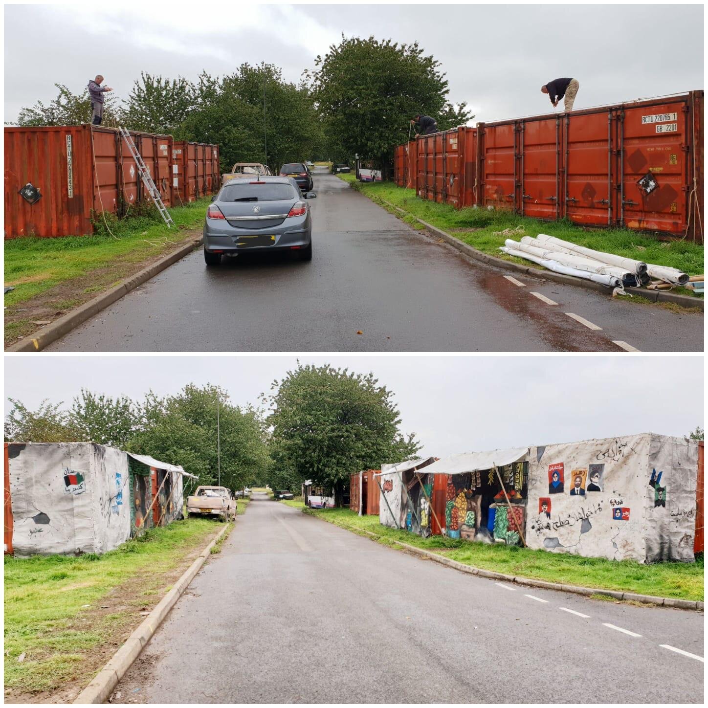
Outdoors: A large scale stage-set project, 2019
WHEN THE STAGE-SET GOES BEYOND THE STAGE
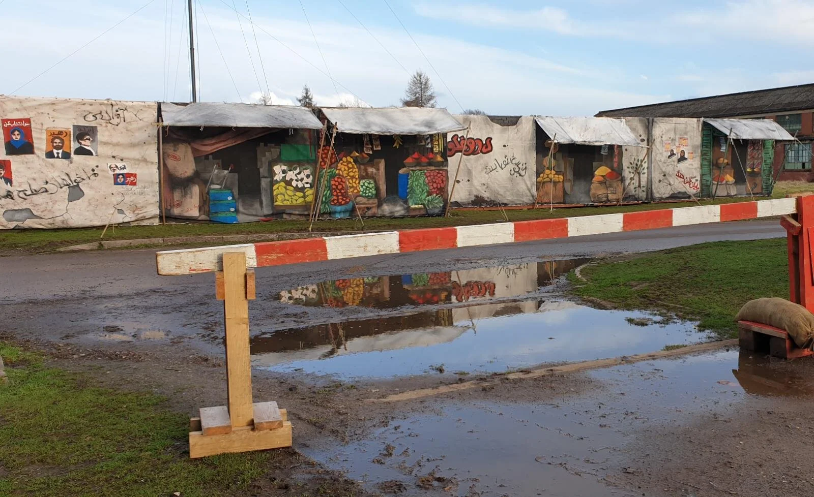
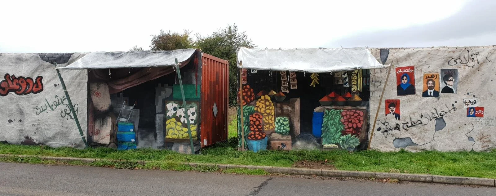
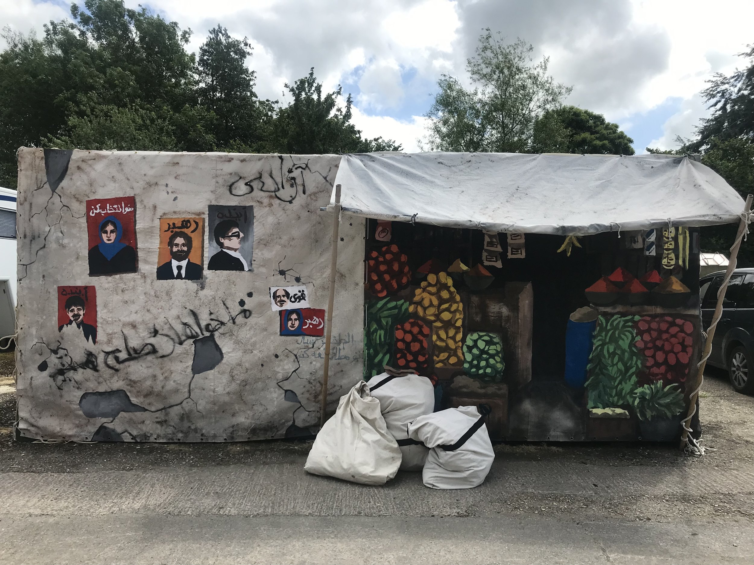
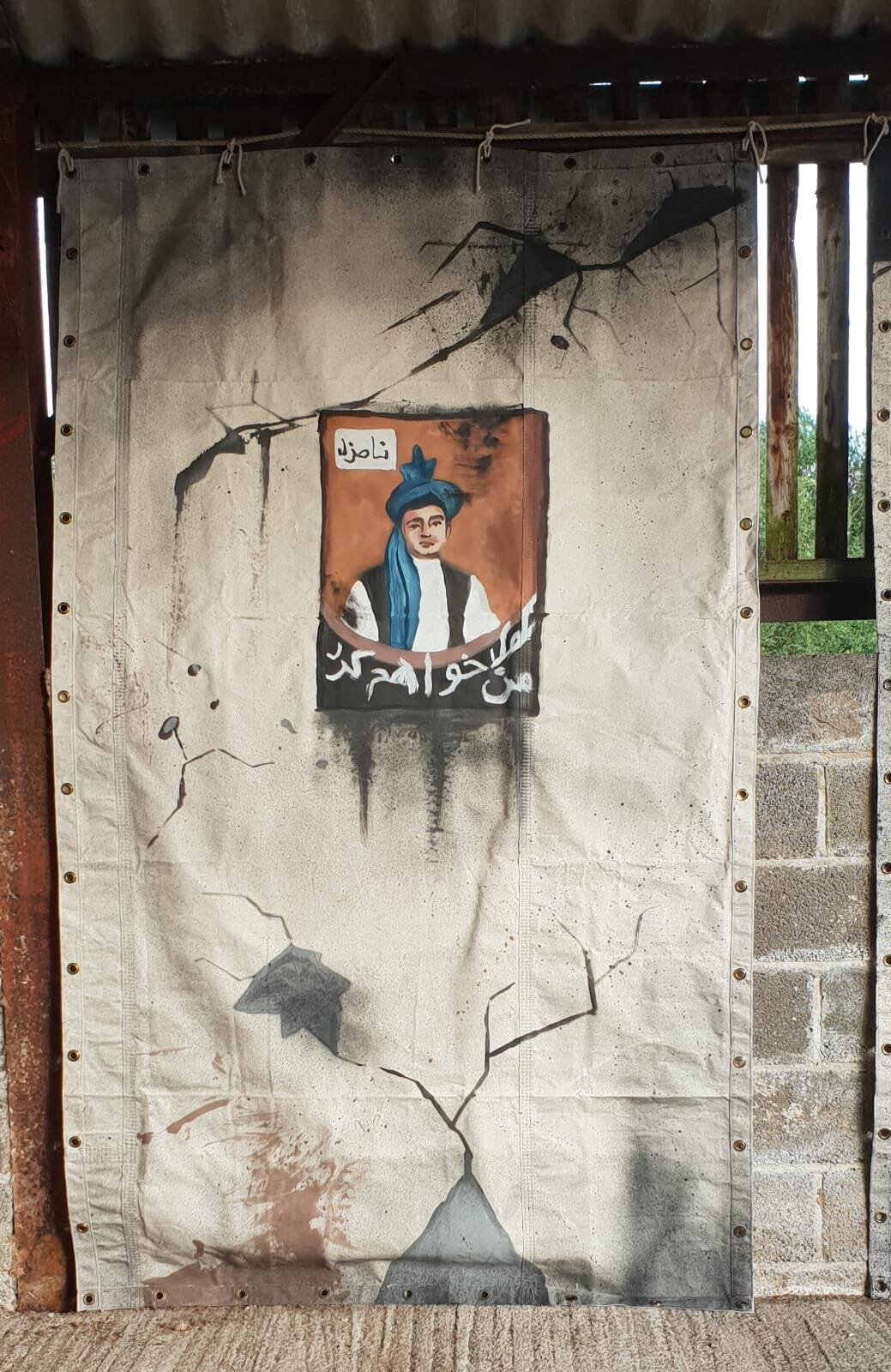
I was very excited to be commissioned to create a series of huge canvas panels that would depict a street of Middle-Eastern market stalls in the modern day. This was for a huge set with hundreds of extras. It was important to maintain a fairly accurate level of representation in the items painted, and the correct written language in the graffiti, and I apologise in advance if we did get any writing style wrong - the messages themselves here are harmless and not all representations of real-life graffiti, they say things like ‘peace.’ We consulted with a group of locals from the specific area we were re-creating, in creating the graffiti. The political figures in the posters are imagined.
PROCESS
The brief was to create several (I think I made between 9 or 11) painted panels that could be strung up outdoors. They needed to be weather proof. Working with the client, we decided that canvas would be a strong option - it was portable, not too lightweight so could withstand some wind, was hardy and could be further treated to be waterproof if needed. Wood panels would be too heavy and a pain to transport, also harder to secure and more likely to catch heavy gusts of wind dramatically.
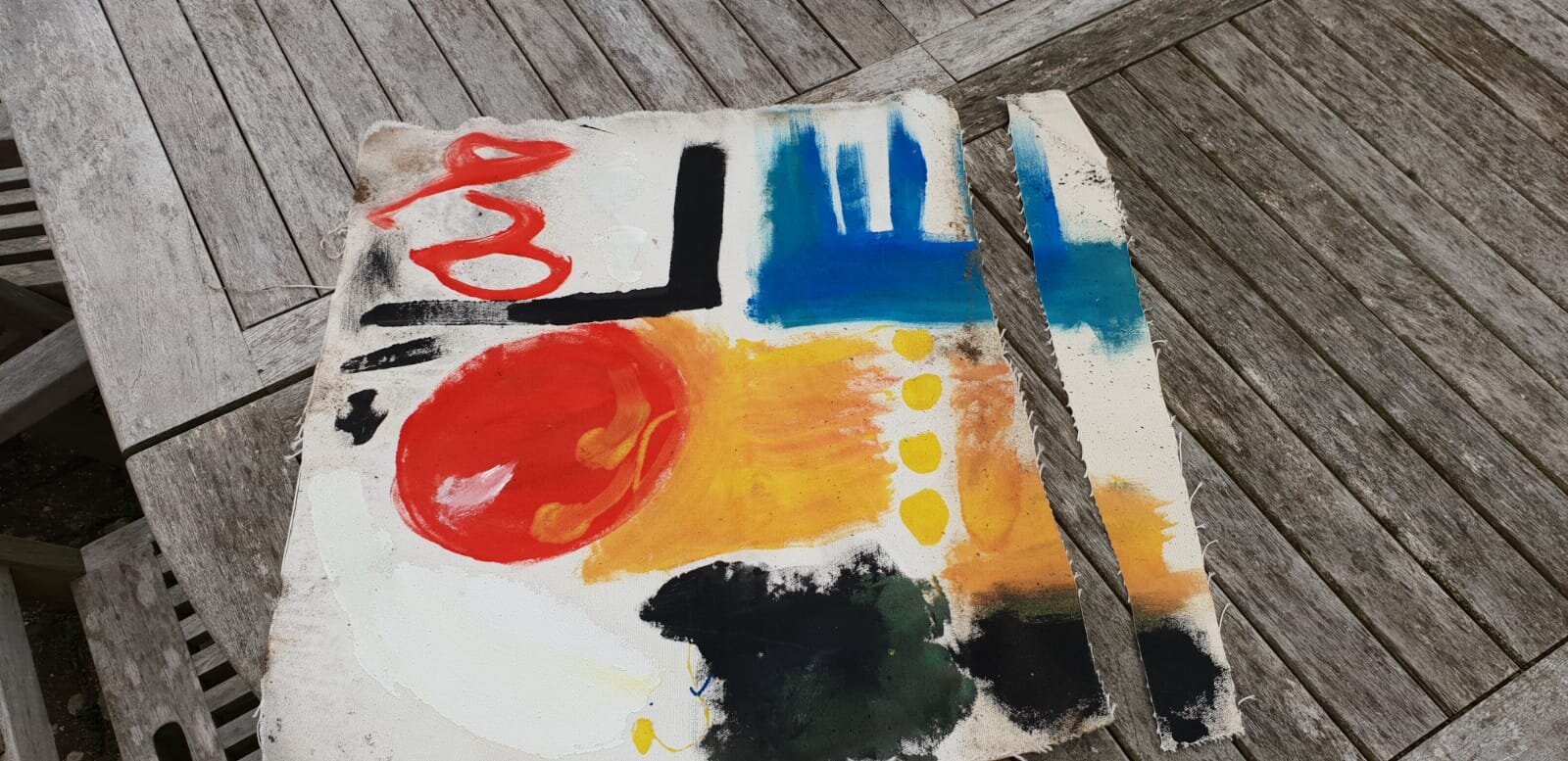
We ordered the cotton duck canvas which is a fantastic material. I did a test patch using the outdoor household acrylics I planned on using (large amount for a cheap price, primary colours plus black and white is all that was needed). The patch was left outside in heavy rain for a week, and there was no leaking or staining around the colour at all which was brilliant. Game on.
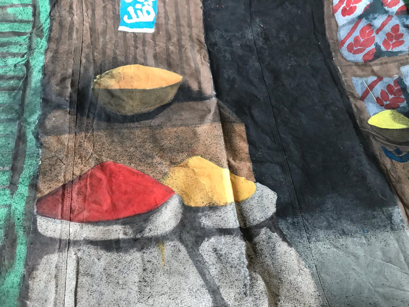
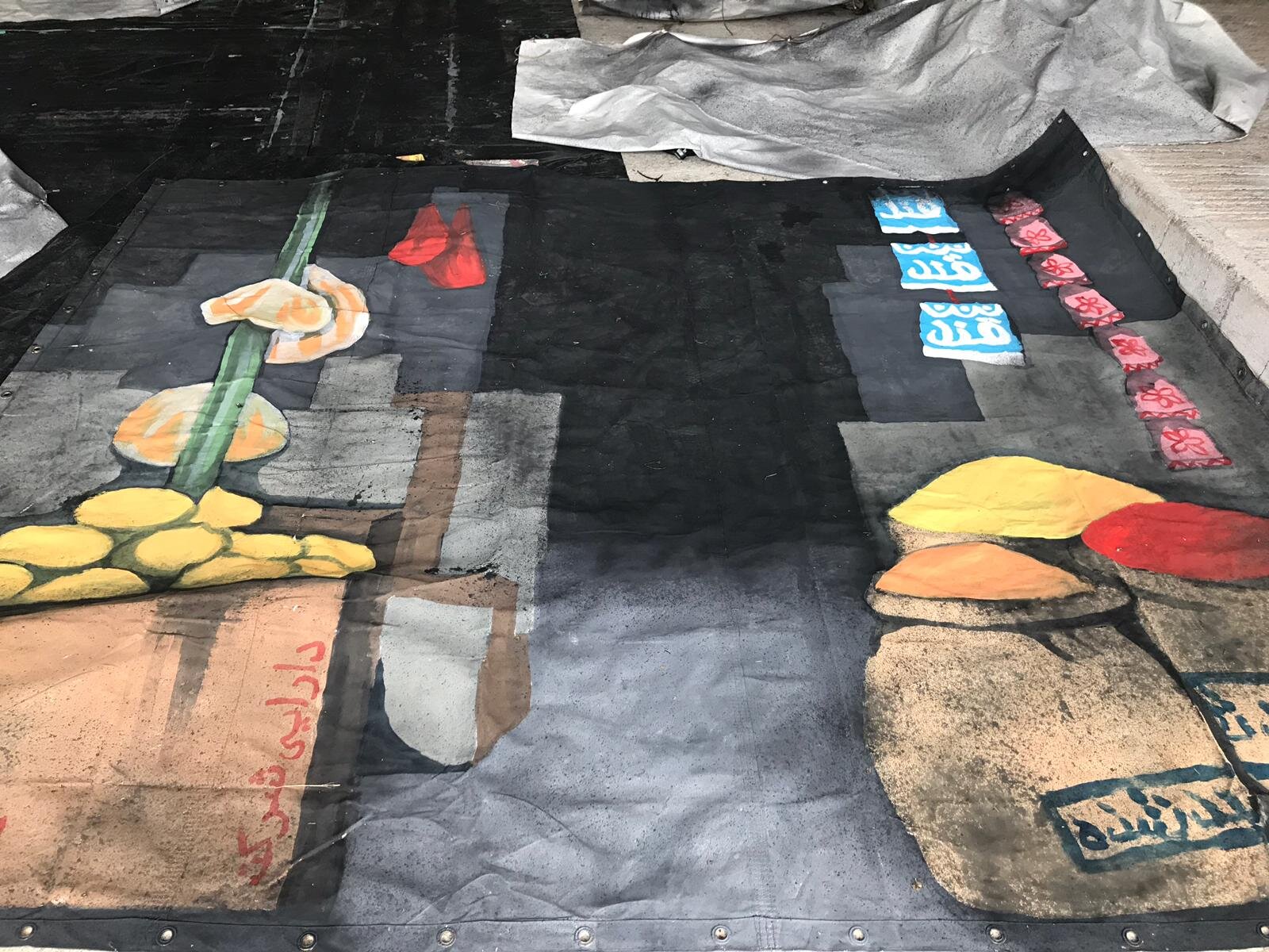
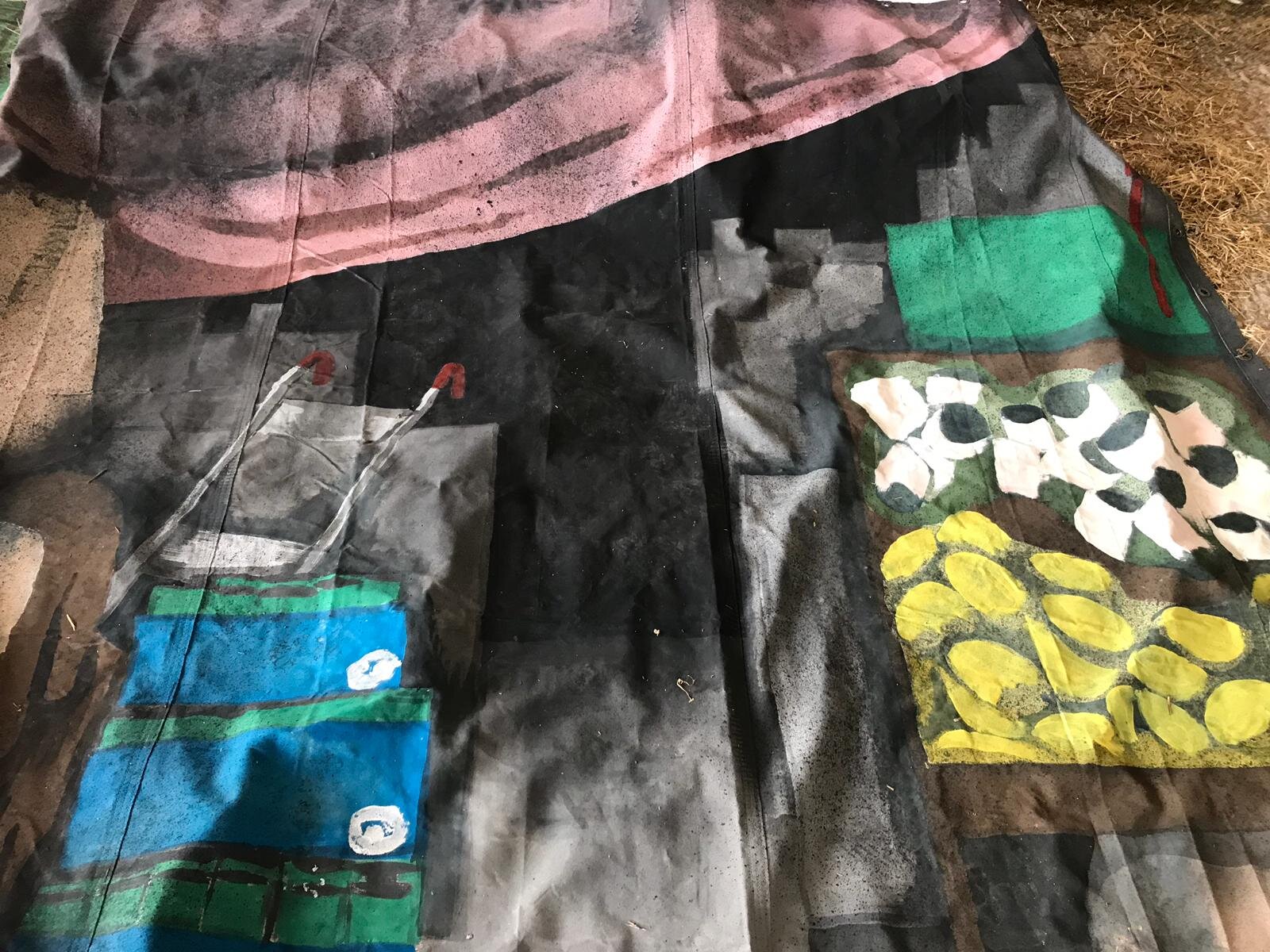
I roughly drew what I was going to paint for each panel before starting. I worked from photographs of markets and village street fronts and checked with experts wether each panel was accurate enough before starting. I worked in an empty barn in the summer of 2019, which was an ideal environment. I laid each canvas flat on top of a tarpaulin layer and worked on two at a time. I drew out the outlines of all the shapes with watered down black paint and a paintbrush - acting like a giant pencil really. Then I filled in the shapes with thicker paint mixed up in decorators trays. I used a range of household painting brush sizes to cover surfaces as efficiently as possible.
The most important technique I used was new to me, but I had seen it done on other large scale artworks: a spray gun. I knew that adding the grain of a dark spray would enable me to create realistic shadows, add texture and a 3D element to other shapes, and tone down areas that were too bright. I started by using up several cans of ready-mixed black spray paint, but it soon became obvious that I needed a much larger amount of spray paint, so I invested in an electric spray gun (a lot cheaper than I thought it would be.) It was awesome. I mixed black paint with the right amount of water - took a few practice runs - then you’re away. I was able to cover huge areas of canvas in minutes and suddenly wall surfaces and shadows started to look really real from a distance.
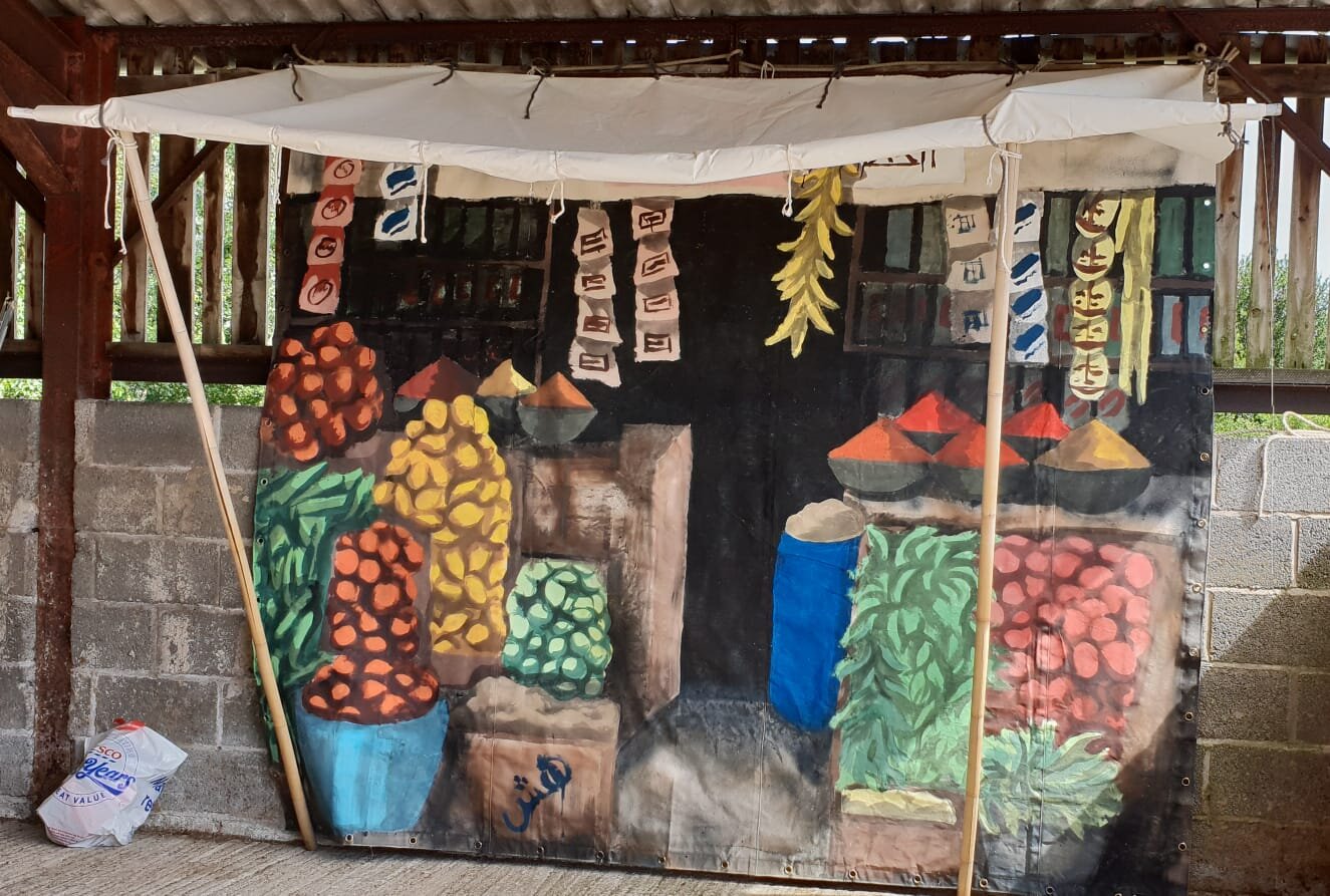
I would then hang up the canvases so I could make final adjustments, as I did above for these two. It is important to note that the aim was to make the pieces look real-enough. We were not aiming for a photographic level of detail - that would take decades of hand painting! The conveyance of objects and distinction of shapes was the most important thing.
Creating this much work was by far the largest project I have ever been involved with. It was a mental challenge, but one that I really enjoyed. It felt most worthwhile to see all the canvases strung up together as intended. I also spray gun “aged” the awnings to make them dusty. I made some mistakes, like tripping into wet paint, but tried to use those marks as natural weathering marks or turned them into another shape.
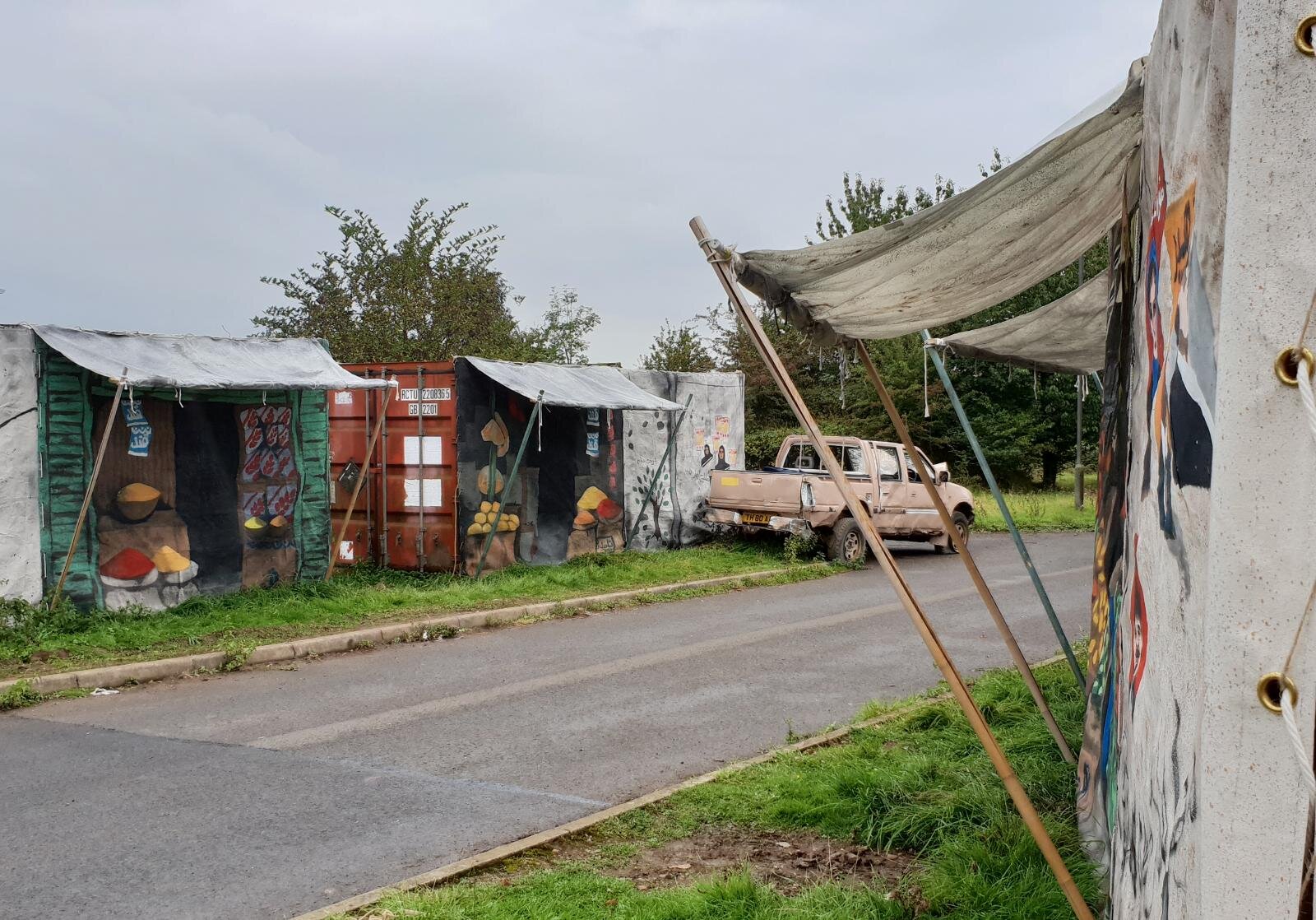
From a distance, parts of the stalls look 3D. All we needed was no trees or very English green grass. The sets I had made though, when viewed all together, hopefully took the participants some way toward a different part of the world. It was a great project to be involved in. Thank you to my client.